
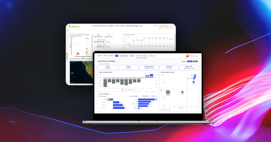
5 principles of a great dashboard design

Dashboards are probably the most common types of reports you can find in the Business Intelligence world. They are data visualization tools that allow users to track the status of the selected Key Progress Indicators – KPIs and other meaningful metrics. They should be tailored specifically to organization’s and users’ needs and provide them […]
How UX adoption can improve Business Intelligence
Both UX/UI and Business Intelligence are very broad terms. However, the most important common part of the two is the users and their experience. Have your users or you ever asked yourself some of these questions? The answer to all of these questions is the proper UX/UI design. Let’s investigate why. […]
Business Value of UX/UI Design

User Experience is often used as a simple “buzzword”, but there’s much more to it than just words. There are many reasons why UX design is becoming more and more popular and starts taking a big role in the creation of any digital product – including the Business Intelligence industry and business reporting. In this […]
Choosing The Right Graph: Part 2
Let’s jump back to the topic of choosing the best chart for any data type. This article is part 2 of our small crash course dedicated to the topic of data visualization types – if you haven’t read it, I strongly encourage you to catch up on part 1 where we discuss the best graphs […]
Choosing The Right Graph: Part 1
When should you use area charts? Can you imagine visualizing trends on the bar chart? Probably not, and there’s a handful of reasons why you shouldn’t. Choosing the right visualization for the given business scenario is not always the easiest thing as there are quite a lot of things you have to keep in mind […]
Visualizing Performance

The purpose of a dashboard is to deliver the most crucial and important information as quickly as possible in an easy-to-understand way. The most important part of the design process seems to be at the first stage, I mean answering the question “what should be shown?”. The second question that should be answered would be […]
10 Nielsen’s Usability Heuristics for UX Design

Jakob Nielsen is one of the most famous people in the UX/UI world – he was often called a “king of usability” or the “guru of Web page usability” so his name is probably well known among designers. Today I’d like you to take a closer look at the famous 10 Usability Heuristics defined by […]
Understanding User Flows
Previously we covered the topic of wireframes, mockups and prototypes and discussed how they can contribute to development of better product and avoidance of unnecessary rework. Now it’s time to take a step back and take a closer look to even earlier part of the UX design that takes place even before designing any wireframes. […]
Wireframes, mockups & prototypes

I believe that many (if not all) people that are familiar with the “UX” and “UI ” terms also might have heard the mysterious “wireframes”, “mockups” and “prototypes”. What’s all the fuss is about? Are those any important to you as a designer and your clients? Are they useful when it comes to report design? […]
Introduction to visual hierarchy
Today I’d like to take a more in-depth look at the topic of visual hierarchy that I previously mentioned in an article about understanding page layout. But let’s start from the beginning and learn what visual hierarchy actually is. What is visual hierarchy? I believe that to many people that have had contact with […]