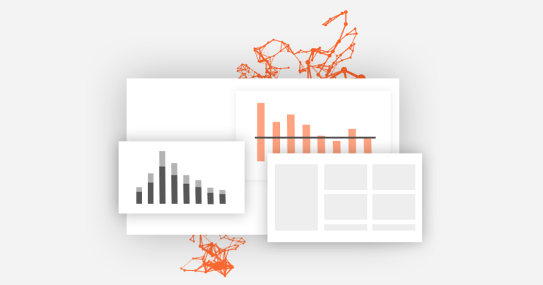
Useful tools for report design
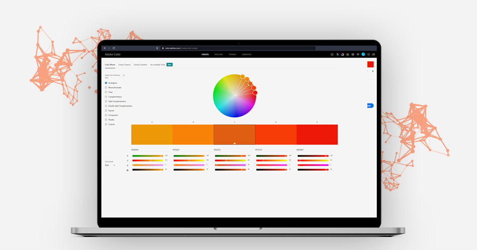
In today’s article I’d like to show you some examples of tools (other than Power BI) that you can incorporate into your report or dashboard design process and benefit quite a lot from. Using these tools you can improve overall look of your product and also make your life easier by working more effective. I […]
The art of data visualization

I want to talk about data visualisation today and raise the subject of how we can improve our data case studies. I want to show you one of my favourite data presentation. In this case, non interactive report – a book, The Annual Report of the ERGO Hestia Group made by Hanna Piotrowska (Dyrcz). […]
Data filtering and interactions in modern BI reports
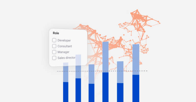
Power BI reports are much more advanced than classical, static BI reports when we’re talking interactivity. Our design should encourage user to click around and “play” with the visuals in order to find new insights and better understand the data behind it. Of course, it doesn’t mean we should enable all available cross filtering features […]
UX&UI – What’s the difference?
Maybe it’s only me but I often see that „UX/UI Designer” fraze is used like a magic spell on clients. What do I mean by that? From mine perspective, still many people can’t see the difference between those two subjects of design and today I want to give you a short explanation. […]
Problematic charts in data visualization – pros and cons
We all have specific preferences when it comes to certain charts and visuals. I know a lot of people love using piecharts and at the same time some people hate them. There aren’t strict rules about what chart to use, however some work best in given scenario, others not so much. You have to be […]
Choosing the right direction of your story

In my last article I was talking about how story is important and how we can visualise it in report design. Today I want to take a step back and show you that every story starts from simple „why and what?” Before you start designing you should ask client or end user some questions […]
Designing CTA buttons and navigation strategies
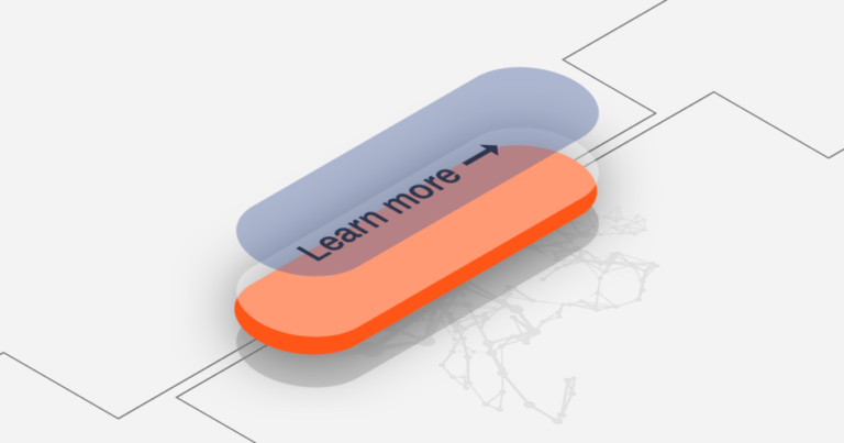
Let’s talk about buttons. They seem like ordinary, insignificant part of user interface that we see everyday and we’re so used to. But still, there is quite a lot to talk about and there are some ground rules and best practices that every designer should know and follow. In today’s article I’ll try to introduce […]
Understanding layout
How people process data on a report page highly depends on some factors such as layout of the page or visual hierarchy. In this short article I’d like to share with you some tips how you can improve UX in BI reports or dashboards by keeping in mind some design ground rules and good practices. […]
From cave paintings through hieroglyphs and movies to report design

To begin with visual data storytelling we have to first answer the question „what is storytelling itself?” and how it can be implemented into design and data visualisations? We’re a very social species and our communication skills grew up over 10 000 years so it seems that there is a lot to cover, but let’s focus […]
Color vision deficiency and data visualization
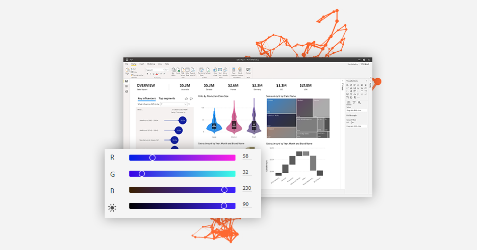
Designing a report that has good UX and looks great is a hard task to accomplish. Color palette of our choice should not only look cool and modern, but also should help the end user better understand the data, highlight key information and guide user’s eye on the report page. That task might become even […]