
When should you use area charts? Can you imagine visualizing trends on the bar chart? Probably not, and there’s a handful of reasons why you shouldn’t. Choosing the right visualization for the given business scenario is not always the easiest thing as there are quite a lot of things you have to keep in mind but it’s not rocket science. In today’s article, I’ll try to lay down some basic rules that should be applied when choosing the right chart for the right purpose.
Status and performance
Visualizing status is very important when designing a dashboard that should give a quick overview and answer the most important questions at the first glance. You want to inform the end-user if they’re on the right track and whether any actions should be taken immediately.
Here’s a list of visuals that are worth considering when visualizing status:
Bullet graph
This is a great choice when you want to visualize a score of some sort. Bullet graphs are a great replacement for progress bars or dashboard gauges as they require less space and can display more information at one glance. The big advantage of the bullet graph is that you can set up qualitative ranges to show whether an actual value indicates bad, satisfactory, or good performance.
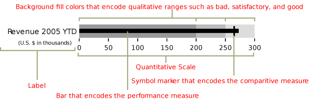
Bullet graph developed by Stephen Few (image source)
Gauges
Gauges are basically the same as bullet graphs, but they use an angle rather than length per se to visualize how the current value is placed on the scale. Using bullet graphs is often a better option, however, in some cases, users are used to seeing gauge visuals, i.e. when visualizing eNPS values.
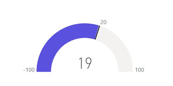
Gauge visual
Cards
These are as simple as it gets – you should use card visual when there is nothing to compare the actual value to and when you want to give the user quick, numerical information. In some cases, however, you should consider using conditional formatting for the font color or coupling the card visual with a tick mark or the X cross (when there is a target that can be met).
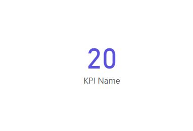
Card visual
Comparison – best graph to compare data
Imagine you want to show the user what are the sales for different product categories. Of course, you could provide them with a set of cards for each category or create a giant table, but there are better charts for the job.
Bar charts
Often the simplest and the best chart for comparing values. Bar charts are graphs that present categorical data using rectangular bars with lengths proportional to the value that is represented by them.
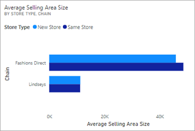
Clustered bar chart (image source)
Clustered Bar Charts
This is the variation of the bar chart that enables the comparison between main categories and subcategories.
Clustered Column Charts
Column charts in general should be used only when plotting the data in the time domain, but when you want to compare the categories in time buckets, clustered column charts are your best friend.
What’s very important for all charts from the bar and column chart family is how you format them. You should consider displaying labels, and if you decide to do so, you should disable the X-axis in order not to show redundant information and not to distract the user. If the chart becomes too busy when displaying labels, go with showing the axis and disabling them – basically the same but other way around.
What’s also really important, but at times neglected is that you always should start your axes at 0 – and that applies not only to bar and column charts.
Tables and Matrices
If you want to show multiple measures at once – go with tables. If you have some hierarchy for the categories (for example categories and subcategories mentioned before) use matrix and its features like collapsible rows to give users more freedom and more information.
But before choosing the table as your main visual, give it some thought whether it’s the best one for the job – using a simple bar chart gives you an advantage of comparing values visually at the first glance, without the need to look at the numbers.
Composition
When visualizing composition there are some basic visuals that are perfect for the job. Some are better for a given scenario, some not so much but it’s important to know your toolkit.
Treemap
Treemaps use automatically calculated areas based on the given values. They might look cool but aren’t my favorite way of visualizing composition data, especially when there are a lot of categories as treemaps need a separate color for each one of them. Treemaps can screw up your design, so think about using a monochromatic color palette or add an “other” category for less significant data in order to limit the number of rectangles displayed.
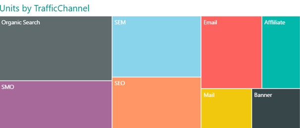
Treemap visual
Pie chart
I could try to come up with some ideas and tips for using pie charts, but I think I will give you a simple answer to a simple question: When you should use pie charts? Never.
I know it may sound silly, as you can find pie charts almost everywhere, but that’s the best answer. You can read a great article by Stephen Few explaining in more depth why using pie charts isn’t a good idea here.
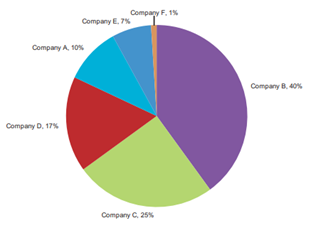
Pie chart (image source)
Stacked area chart
A stacked area chart is a derivative of a basic area chart. It shows how the parts of the whole changed over time. Each color area represents one constituent category. There ate two types of area charts: standard stacked area chart and 100% stacked area chart.
As it can be a good visual for some scenarios, you should be aware that a lot of times it can be misleading and hard to read for inexperienced users. You can read more about why that can be the case in one of my previous articles “Problematic charts in data visualization”.
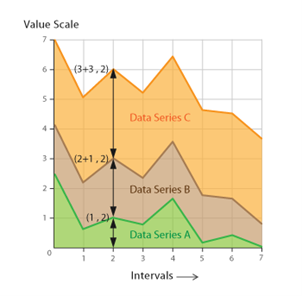 Stacked area chart (image source)
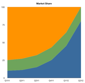
100% stacked area chart (image source)
100% stacked column chart
Often good substitute for 100% stacked area chart, especially when the data is discrete and displayed in a month or quarter buckets. 100% stacked column charts give you straightforward information about the composition of each bar as comparing length is a very simple task for the human eye. Consider enabling labels for better data presentation, but remember that for a large number of categories the chart can become cluttered – disabling labels and enabling Y-axis with grid lines might be a solution to the problem.
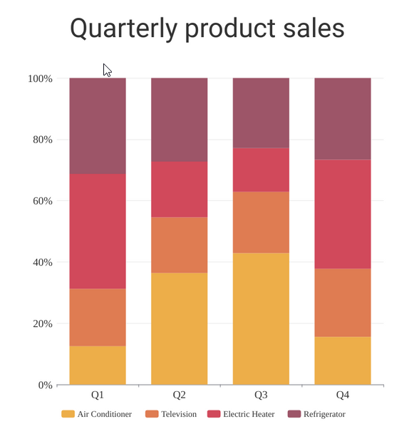
100% Stacked column chart (image source)
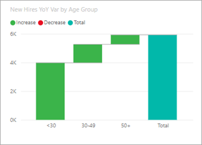
Waterfall chart
Waterfall charts enable users to understand what is the cumulative effect of positive or negative values applied to the starting value – in other words, it shows you how a starting value became a final value over time. Waterfalls are mostly used in business applications, but they can be used to visualize any other process showing additions and subtractions to a starting value.
What’s important here is also how you format the chart: decide whether you want to show the labels or the axis and carefully select colors for positive and negative values – remember that your designs should be accessible to color-blind users also.
Waterfall chart (image source)
Next month, we will dive deep into best types of charts for visualizing trend, distribution, relationship and geo data, so stay tuned.
Michał Stryjczak
Read more:
10 Nielsen’s Usability Heuristics for UX Design