
The purpose of a dashboard is to deliver the most crucial and important information as quickly as possible in an easy-to-understand way. The most important part of the design process seems to be at the first stage, I mean answering the question “what should be shown?”. The second question that should be answered would be “how” to show it. But for now, let’s focus on why in the first place we should visualize performance.
Why visualize performance
Of course, you could have a big table with all KPI’s, targets, previous values, etc. as the landing page of your dashboard but that wouldn’t make a good one. Using different visualization types, colors or icons gives you the advantage of minimizing the cognitive load and conveying the message faster and more effectively.
Best visualization types
There are many different ways to visualize any given KPI and how we show it depends on the datatype or business scenario. Let’s take a closer look at available visuals that we can use for a KPI monitoring performance.
Gauges
These are probably the most famous visuals to show status and current performance. I don’t think that they’re the best choice in most cases, but I often use gauges in some business scenarios.
The anatomy of a gauge is quite simple and obvious, but there are some differences between gauge visuals. It consists of a curved scale and a dial, just like the speedometer in your car. For a gauge visual to work we should have minimum and maximum values so the scale makes sense. You can use color to show different thresholds or zones and quickly visualize where the current value is on that scale. You can also visualize a target as a line on the scale so more information is conveyed by a quick look at the visual.
Having its upsides, gauges have also a big disadvantage similar to piecharts – they use angles to visualize a value and the human eye is not best at comparing angles – it’s much easier to compare length (I wrote about that topic more here).
However, I think that there is a place for gauges in some scenarios. First one that comes to my mind is visualizing eNPS on a scale from -100 to 100 – simply because people are used to that way of showing the eNPS data. I think replacing the gauge with a different type of visual in that particular case would do more harm than good because people know what to expect when they think “eNPS”.
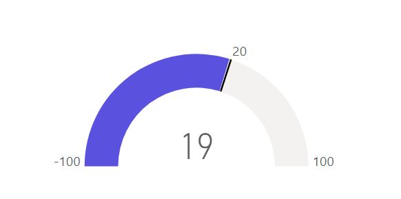
Gauge chart with the current value in the center, min and max values, and a target
Bullet graphs
These are quite similar to gauges, but they use length rather than angle, which seems to be the best way for our brains. You can show the same kind of data as on the gauge chart: current value, thresholds, targets, or last quarter data.
Another reason thy I think bullet charts are a better and more effective choice is that you can place several bullets on one scale for better comparison and also you can save some precious space on your page.
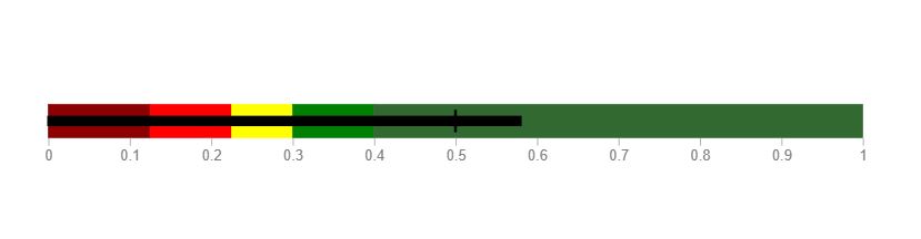
Bullet graph with scale, target, and colored states
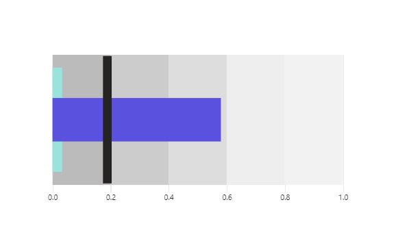
Bullet graph with scale, target states, and comparison value
Cards
Sometimes showing the number is just enough – if there isn’t a minimum and maximum value. Therefore showing a simple card might be a good option. If there’s a target you can use conditional formatting to dynamically change the color of a card, but that should be double color-coded as a difference in color could not be seen by a part of your audience that suffers from color vision deficiency – a good idea is to add an icon next to a card with a simple tick or X showing whether the target was met or not.
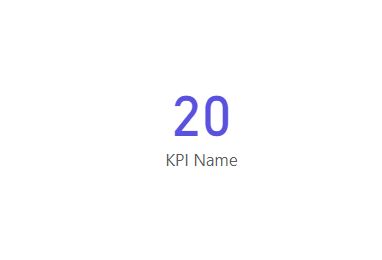
Card visual
How about donuts?
Well, you probably know that I am not the biggest fan of using pie charts and donut charts, I think that in one particular case donuts are actually an attractive choice.
When paired with a card showing the value in a center, donuts are worth consideration when our goal is to visualize percentage (maybe not the best idea if there is a target different than 100%). When we don’t have multiple categories shown on a donut chart but a single value I think it’s easy to read, especially when the number is placed in a center. And also, that looks quite good if you ask me.
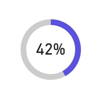
Proper usage of donut chart paired with a card
Show the context
When showing the current performance, regardless of what type of visualization we use I think that it’s important to show the broader context: information whether we’re on the right track. When possible I believe you should provide the user with information on how the value changed in a given period of time: a year, month, or day. That can be accomplished by showing an arrow next to a KPI showing the direction of change (you can also use color-coding to better convey the information). You can also show how much the value changed and color is also your best friend here.
Regardless of a scenario that you’re dealing with when visualizing the performance, I think that it’s always best to stop for a second and consider different options and decide what will work best for the user and what information they’re looking for.
Michał Stryjczak