
Today I’d like to take a more in-depth look at the topic of visual hierarchy that I previously mentioned in an article about understanding page layout. But let’s start from the beginning and learn what visual hierarchy actually is.
What is visual hierarchy?
I believe that to many people that have had contact with the UI design in general, term “visual hierarchy” might ring the bell. Basically, visual hierarchy is used to organize and structure information presented on the user’s screen in a way that makes the UI logical, consistent and declutterd. Keeping in mind a couple of visual hierarchy principles helps us plan the layout and have control over visual importancy of each element and the order in which the user perceives each element or group of elements.
Visual hierarchy is crucial at early steps of the design process and have big impact on information architecture and consistency of the end product. A good use of visual hierarchy can improve overall user experience reduce the effort needed to interact with the UI.
Let’s take a closer look at a couple of principles that will help you better organize and declutter your projects.
Scale
Probably most intuitive way to make an element more important visually is to increase it’s size. Bigger elements stand out more and are the first that user perceives. Apart from just making any certain object bigger, typography plays a big role here. Increasing the font size and weight let’s you structure the information in preferred order.

Hipcamp.com – visual hierarchy is built mostly by font size – the eye will read the title first, before jumping to other elements on the screen.
Color and contrast
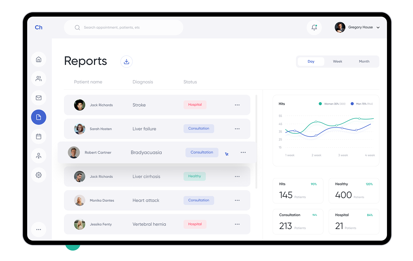
Another way to highlight a certain element is to use saturated colors and play with contrast. Probably, you can’t imagine great looking black and white interface and there is a reason to that. Color helps emphasize interactive elements, make any section stand out from the rest (when designing a report page for example, you can use your theme color for the background of the most important KPI). Also, colors with higher contrast will appear stronger and more important.
You should, however, be careful when applying color to your project – it’s easy to overdo it and loose the strength that it gives you.
Couple of important points:
- Bright color applied to text may suggest interactivity
- Don’t use too many colors – you don’t want make your design look like rainbow
- Consider saturation – grading a certain shade may help you build preferred hierarchy
- Don’t use too many variations of the same color
- Keep in mind that people with certain types of color blindness may be your users
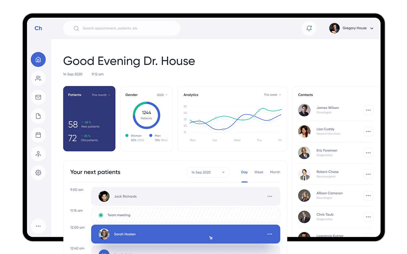
See how color was used to highlight most imporant info on the user interface (image source)
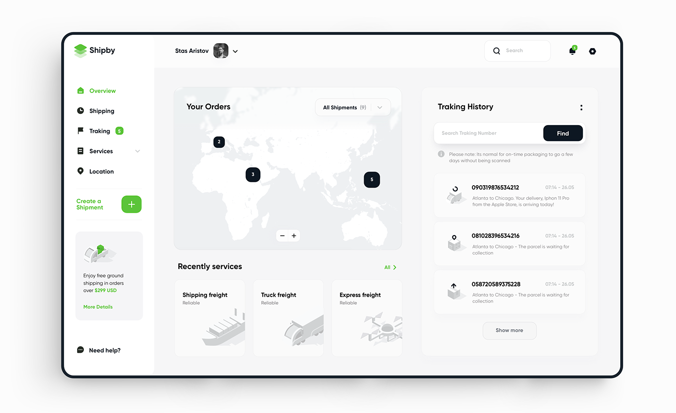
Grouping
Grouping similar elements is a powerful way to organize your layout and build hierarchy. Grouped elements appear as part of the bigger whole and are easily distinguished from the rest of the UI. Without grouping, there wouldn’t be a clear distinction between certain UI areas such as navigation, content etc. It would be a lot harder for the user to make sense of your design if certain parts wouldn’t be grouped in one place.
Grouping principle relies on proximity and enclosure laws that are part of famous Gestalt laws.

See how grouping similar elements make the design look
more logical and less cluttered (example: Spotify app)
Alignment
Aligned elements, just like with grouping, seem to be associated with each other. Think of any table – when columns are aligned, there is no need to place additional dividers – the human brain can easily make sense of the design. Alignment is important in the design in general, but especially when it comes to building UI areas such as navigation bars, menus etc. that use repeated elements that are part of bigger group.
A table with aligned columns doesn’t need additional separators (image source)
Whitespace
In my opinion the most important and the most neglected way to build a visual hierarchy. It’s easy to overload the screen with information and try to squeeze as much as possible in one page. Designers often forget, that proper whitespace is almost as important as the content itself. Having clear spacing between sections is crucial for the user to easily distinguish between different parts of the user interface. But again, remember not to overdo it and keep your whitespace sections in the sweet spot – having too big margins and separations can also make your design look ugly and make you loose precious space on the screen.
See how whitespace was used to separete different groups and groups of elements (image source).
Typography
Typography is essential when working on good looking and logical UI. Aside from choosing the right typeface (you should forget about Comic Sans) you should pay a lot of attention to font size, weight and a spacing. It’s a combination of previous principles, but it’s important that you understand that those principles apply to the text as well. Check the example below and see how text was adjusted in order to build visual hierarchy.
Of course, there are more ways to improve and build visual hierarchy, but the ones presented in this article seem most important for me and are the basis of other principles. I encourage you to start experimenting on your own and expand both your skillset and knowledge.
Michał Stryjczak
Read more:
Advantages and disadvantages of charts in data visualization