
How people process data on a report page highly depends on some factors such as layout of the page or visual hierarchy. In this short article I’d like to share with you some tips how you can improve UX in BI reports or dashboards by keeping in mind some design ground rules and good practices.
Reading patterns
There are some well established patterns that human eye tends to follow when scanning content on a screen. We don’t usually read every word from left to right but rather fixate on certain parts on the screen for a moment before jumping to another part. How user will read content depends highly on their task, their assumptions or page layout. However, we designers, have a lot of control in this field and we should try to guide user’s eye by using some layout techniques.
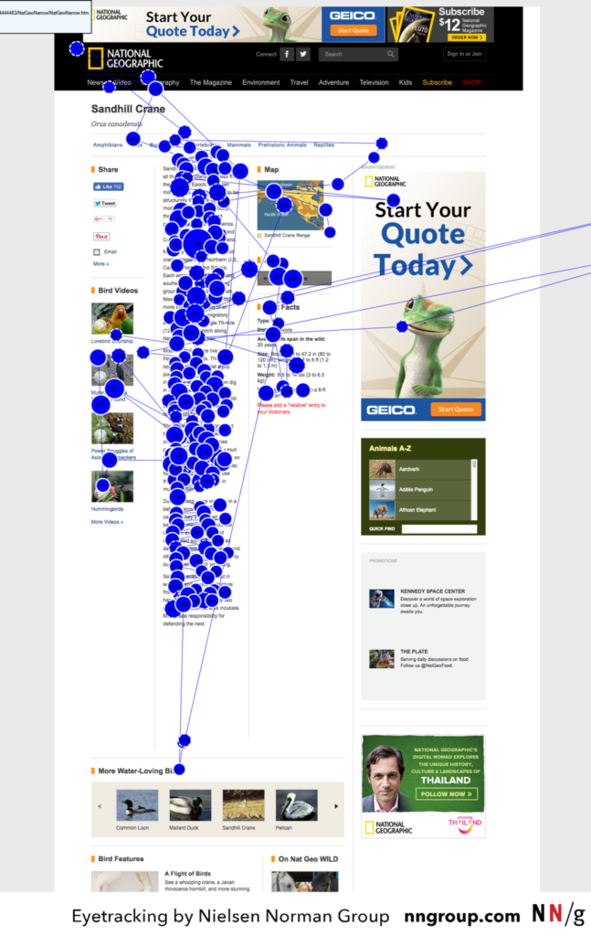
F-pattern
On text heavy pages that lack headings or bullet points people tend to fixate on top of the page and beginning of the lines. That means that people give more attention to the top and left of the page than the bottom part.
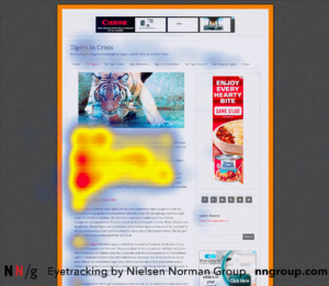
Spotted pattern
Sometimes, people fixate on parts of the screen that stand out more than the rest of the content. On text heavy pages that would mean headers, bold text, hyperlinks (or text different in color in general).
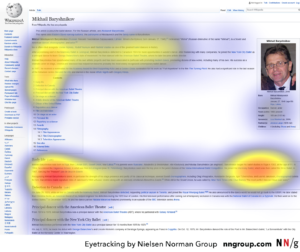
Layer-cake pattern
In some cases, people’s eyes fixate mostly on headers or subheaders in horizontal lines – this pattern resembles layers of the cake (hence the name). When analyzing heatmaps we would find that people also pay attention to some specific areas of the text – that happens when they find interesting part by reading heading and then start to read the rest.
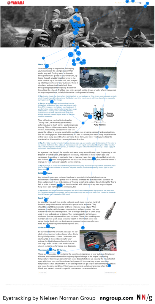
Commitment pattern
The commitment pattern describes traditional reading, when all content is read by the user. That pattern occurs with highly motivated users, when they trust the source or are interested in getting more information. It’s worth mentioning that even for commitment pattern structuring text by using whitespace, controlling text weight and size and using headers and subheaders will improve user experience.
Z-pattern
The Z-pattern is in my opinion the most important pattern we should keep in mind when designing the layout of the BI report or dashboard, since reports don’t usually include much text but consist mostly of other elements such as data visuals or slicers.
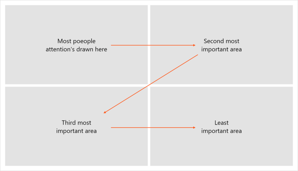
In this pattern, eye fixate on top left part of the screen, then moves to top right part, then to the bottom left part and lastly to the bottom right part.
Of course, in real life things aren’t that simple and we can’t simply order visuals from left to right and consider our job done. Often we have to compromise when we have to fit several elements on a single page, we are often limited by minimal size of a visual or some other client requirements. But we still have some aces up our sleeve and couple of ways to guide user’s eye and build proper visual hierarchy.
Visual hierarchy
Visual hierarchy is basically how we prioritize information. Besides using hierarchy patterns described above, you can also structure information on a page by following some design principles and adjusting element’s properties.
- Size – build hierarchy by changing size of certain elements – bigger objects tend to draw more attention
- Contrast – use stronger contrast in elements that are most important
- Color – saturated colors are more eye-catching
- Whitespace – including whitespace around an object makes it stand out more from the rest of the page
- Repetition – repeated elements draws user’s eye
- Alignment – some elements on your page are expected to be in a certain place
Of course, always keep in mind that your design should look clean and consistent.
Michał Stryjczak
Learn more
Below I attached some useful link that you can use to expand your knowledge.