Designing a report that has good UX and looks great is a hard task to accomplish. Color palette of our choice should not only look cool and modern, but also should help the end user better understand the data, highlight key information and guide user’s eye on the report page. That task might become even harder if we take color blindness into account. But is it worth the trouble? Are there ways in which we can help color blind users to better understand the data and keep our report good looking at the same time?
What is color blindness (or, to be more specific color blindess deficiency)?
We are able to perceive color thanks to three different types of cones located in our retinas. Each type of those cones reacts to a different part of the light spectrum (red, green and blue) and color that we perceive in the end is basically a result of how much each type of those cones is stimulated.
But, do all people see colors in the same way? Unfortunately, for us designers and people working with data visualization in general, no. If the sensitivity of one (or more) type of cone is shifted towards different part of the spectrum, or certain type of cone doesn’t work at all people can see colors in totally different way than most of us do.
Research shows that about 8% of men and 0,5% of women suffer from color blindess defficiency to some extent. It doesn’t necessarily mean that they don’t perceive color at all (hence the term “color blindness” might be misleading), as 99% of color blind people can actually see colors, but they have trouble with distinguishing between certain colors and shades.
Types of color blindness
- Monochromatism – The most problematic type of color blindness; no cones are available or just one type of them – that means that person suffering from that type of CVD sees world in black and white.
- Dichromatism – Only two different cone types, are available the third one is missing completely.
- Anomalous trichromatism – a slight defect of color vision in which the proportions of the three primary colors are shifted. That results in narrower spectrum visible to people suffering from that type of CVD.
Both dichromatism and anomalous trichromatism can be broken down to additional 3 types:
- Tritanopia/Tritanomaly: Missing/malfunctioning cones responsible for perception of blue.
- Deuteranopia/Deuteranomaly: Missing/malfunctioning cones responsible for perception of green.
- Protanopia/Protanomaly: Missing/malfunctioning cones responsible for perception of red.
Problems faced by color blind people when it comes to data visualization
But how actually CVD affects user experience when it comes to reports, dashboards or data visualization in general?
Not being able to recognize series or categories
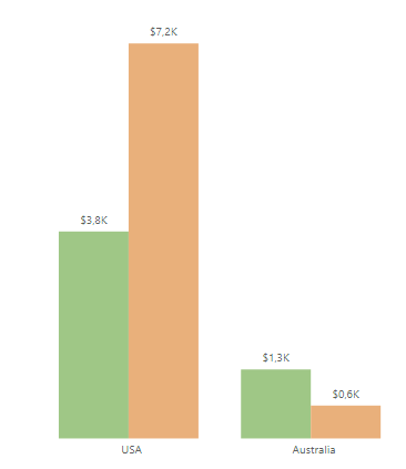
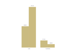
Probably, the bigest problem occurs when user suffering from CVD has to distinguish between series or categories. Certain colors that look totally different for healthy person can look almost identical in that case. Below you can see an example of a clustered column chart as seen by healthy person and person suffering from protanopia (red color blindness):


As you can see in some cases of CVD colors of some charts can look identical so it’s crucial to test final color palette for CVD accesibility.
Understanding key insights
Another problem that might occur is not being able to recognize key message at a glance. For example you might color code your graph in such a way that increase is colored in green and decrease is colored in red. But, if you only used colors, that crucial message wouldn’t be noticed by some people.
Things to consider
Of course, we can try to combat those CVD-related problems by keeping in mind some tricks and good practices.
Plan your color scheme beforehand
A good practice would be to select colors for your report before you actually start working on a layout and chart selection. Preparing and testing your color palette beforehand could save you a lot of time, especially if your report has a lot of visuals and a lot of pages.
Use visualizations that don’t only use color to convey the message
Probably the best way to make sure your chart will be easily understood by all users is careful chart selection. You should be careful when using visualizations that use only color to diffrentiate between data series. Therefore, often a simple coulmn chart would be a better option than a treemap or a pie chart (it would be a better option for not only that reason, but let’s save it for another talk).

As you can see, bar chart needs only one color, whereas treemap needs a lot of them. When designing for CVD accesibility less color = less problem.
Limit your data
In some cases, you could also try to show only most important data and show less critical data as “others” – it’s another way to limit colors needed in a graph.
Double encode key information
When working with critical information, such as good and bad performance you should always double encode for reasons stated above. A good way is to use text or icons besides color to emphasize key insights and make your chart clear and understandable at a glance for every user.
Use shapes and textures
When using various types of line charts you should use different shapes for data point markers. Also, if your software enables you to do so, you could use different textures for filling clustered column charts or area charts.
Pay attention to contrast
Rather than using different colors you should work with different shades of the same colors. Firstly, it’s more appealing design-wise but most importantly, change in luminance (a measure used to determine how “bright” the color is) will be always visible even to a person suffering from monochromacy.

I hope that my article shed some light on CVD related problems in data visualization and gave you some perspective on what to have in mind when visualizing data for colorblind users. For more information about CVD I recommend you visit color-blindness.com. You can also find there a handy tool that you can use to simulate how your visualizations would look like to a person with CVD.
Michał Stryjczak
