

Dashboards are probably the most common types of reports you can find in the Business Intelligence world. They are data visualization tools that allow users to track the status of the selected Key Progress Indicators – KPIs and other meaningful metrics. They should be tailored specifically to organization’s and users’ needs and provide them with a quick answer to the question they have. Creating a good dashboard might sound like an easy task, but it’s most definitely not. Especially creating a great one. In this article, you’ll learn more about 5 dashboard design principles that can take any dashboard to a next level.
Give users context & push them in the right direction
A good dashboard shouldn’t leave users with unanswered questions but rather provide them with answers whenever possible or at least point them in the right direction. If the user sees an example of a bad performance, they’ll want to know what happened, when it happened, and most probably who’s responsible. It doesn’t bring much value when the user is presented only with the information “your KPI is below target this month”.
To put things in more context it is important to give the user access to other tools: visuals supporting the KPI or links to external reports that will explain the data in more detail.

Don’t add unnecessary noise
Sometimes it’s easier to overcomplicate things than to give users a simple, and easy-to-use tool. This is especially true when it comes to dashboard design. Providing users with too much data, too many KPIs and too much granularity may overwhelm the user and unnecessarily complicate the analysis process. Remember to keep things simple, or at least as simple as possible. You should anticipate what users might need and what decisions they will be making, and then ask yourself the question what should be the visualizations that would best support the decision-making process.
Use the right charts
This should go without saying, but it’s often that users are left with a report that doesn’t follow data visualization rules and best practices. Poor use of visuals, aside from making the data harder the understand can bring users to wrong conclusions. This is especially true for visuals like pie or stacked area charts.
Whenever designing a dashboard, keep in mind the following:
- Use the right graph to the right data
- Use color cautiously – especially in dashboards, a misuse of color can bring users to not valid conclusions
- Keep in mind organizational standards
You can read more about what are the best practices for chart selection in previous articles:
Choosing The Right Graph: Part 1
Choosing The Right Graph: Part 2
Show status
If it takes too much time for the user to find the information that they need at the moment, the dashboard is poorly designed. The key message should be conveyed at a glance so it’s easy for the end-user to understand whether they need to analyze the data further, go to a different report, or if everything is on track and they don’t have to worry about their performance.
This can be accomplished by:
- Highlighting the most important KPIs and good use of visual hierarchy
- Using color for conditional formatting
- Adopting iconography – for displaying change, relation to the target, etc.
- Supporting the data with text messages
A single KPI doesn’t give the user much value. However, when you put in the right context with the target or change over time it suddenly can tell much more.
Here you can learn more about how to visualize performance and show status.
Test with your users and look for meaningful feedback
Any dashboard should be prepared for evolution in the future. The users change as well as the business realities so there should be always room for an iterative approach. Any dashboard design process should start with user research to learn more about how they work, what is meaningful information that they need, and what they focus on during day-to-day work. What’s also important, it’s a good practice to collect feedback from the users after the launch of the dashboard, especially after some time has passed and they became familiar with the tool – the feedback they might have might be at a premium and might lead to developing a great and intuitive tool.
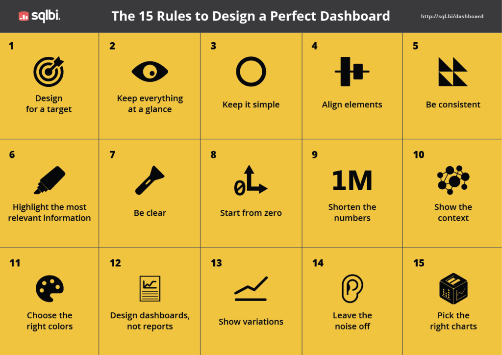
Here’s a useful cheatsheet for dashboard design with tips that are also worth remembering:
Michał Stryjczak