
To begin with visual data storytelling we have to first answer the question „what is storytelling itself?” and how it can be implemented into design and data visualisations?
We’re a very social species and our communication skills grew up over 10 000 years so it seems that there is a lot to cover, but let’s focus on the basics. Every message, either verbal, text or image is telling us something – we want to pass some specific information through that. What kind of message do we get from famous cave paintings from over 9000 years ago? What our ancestors tried to communicate? Or maybe even simpler question, is there any story? I think there is a story and the message is very simple – „folks, I was hunting and I saw this giant bull and it was hard task to hunt it down”. As you can see, this message was told by using very simple visual language of stickman drawing and simple shape of an animal.
We discovered first principle of good visualisation – it has to be simple and understandable for everyone.
Let’s go further and skip couple of centuries and jump into ancient Egypt. Besides architectural achievements Egyptians came up with a brilliant idea of quasi text communication – hieroglyphs. They used simplified and clearly defined symbols which can be used to tell better, more specific and detailed stories. By merging consonant symbols they could make sentences to be more specific – thanks to that they could built longer stories and they could convey more emotions and more abstract definitions. I like to think that we have come full circle and these days we’re using something similar to hieroglyphs too! What about whole library of emojis on your device? We can even try a quick challenge – comment this post and express your thought by using only emojis! 😉
We’ve come to the next principle of good visualisation – by using certain symbols we can communicate more information and by using symbols in sets we can build even a full story. But still, it’s based on very minimal visual language.
Let’s jump again, this time to more current times – times of movie industry. I think I can assume that we all love to watch movies, and I’m very certain that we all have very different taste. Some of mine beloved movies will not be loved by others and some of yours will not be loved by me. But still they all have something common – the story structure. Each one of them should have basic structure of beginning, middle and ending. In the beginning we get to know main characters, we discover them, what kind of people they are, how they feel and what’s their problem etc. Next in the middle part, together with character, we go through the journey of their story. We watch how they solve problems and how it affects them and how the events will turn out at the end. In the last part we witness how all consequences affected characters and what they achieved or not achieved. We can clearly see that this is it – the end of the story is here and it finished like this.
Our last principle – the story structure. We have to have in mind what should be presented as first thing to the viewers, what should be in the middle, and what should be on the end. Using this structure we will be sure that our story will be understood by all of the viewers the same.
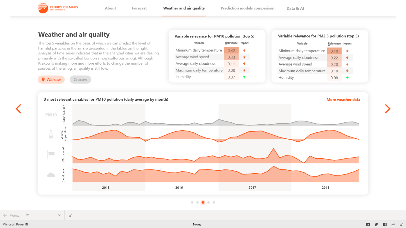
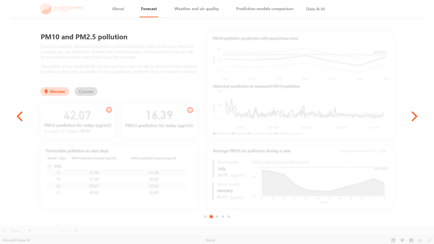
Okay we briefly went through some examples from the history but where is design and what’s more how we can adapt those things into data visualisations? Let’s take this report built in Power BI for example.
Working in reporting, data visualisation and so on I noticed very common mistake in the process of designing a report. Many people only pay attention to visualisation types – it isn’t bad approach and it’s important thing to use certain type of charts to certain data. But this approach is a bit narrowed.
We have to look at the report from bigger perspective because we’re trying to communicate certain information and it should be one consistent story. Think of movie structure and how it can be adapt in report design? Can we use “beginning, middle part and ending” approach in our report design? Ofcourse! Before we start designing we should ask ourselves what kind of story we want to tell, what information users should get from it and when?
Beginning – here we should put some basic information what this report is about, what we can learn from it etc. It can be a short text explanation to help viewers understand what they’re looking at. We can highlight there some general data information like KPI’s to tell what is general situation to get the overall perspective.
Middle part – next, we should think about what kind of information will be interesting to see. What information from the overview we can expand to show more valuable details? In this step we should have very good knowledge about our viewers – what are their needs and what kind of insights they are looking for. On this stage „user interface” is very important thing because we’re building our story through report structure and users should clearly see what page they are on and what they can expect there. They should also see how to go further through the story so every navigation button is very important. There are tons of design principles and design solutions of report structure but the main character in our report is the viewer. So be bold, experiment and try to work together with your audience.
Ending – all movies have their own endings and in our report we should have it too. Our ending should be the deepest layer of details of information. And we should think about the ending from the very beginning of design process because it shouldn’t take to long to go to the deepest layer of information – imagine that user will have to make 5 and more steps to go to the deepest details, it will be too long journey definitely. Try to keep it simple with more information and insights on one page without many steps.
I think there is a lack of basic mindset where we as designers forget about most crucial part of our job – the story. We have many principles based on many analysis and studies and we use them a lot but we often forget about the story which is the most important message to the viewer. Try to talk with your audience a lot to get known their stories!
Has the user received the message he wanted? Was it understandable? Was it easy to get?
Greg Stryjczak
Read more about UX design and data visualisation: