
In today’s article I’d like to show you some examples of tools (other than Power BI) that you can incorporate into your report or dashboard design process and benefit quite a lot from. Using these tools you can improve overall look of your product and also make your life easier by working more effective. I divided my list into 3 parts: design tools, design assets and accessibility tools that you can use to make sure that your report is color blindness friendly and accessible for all of your audience.
Design tools
First part of tools that I want to mention are tools that can help you in your design process: starting from planning and designing layout to tools that can help you select color palette.
PowerPoint
PowerPoint is a tool that almost everyone is familiar with. Some love it and all functionalities that it comes with, other not so much – as a designer used to other specialized design software I sometimes find working in PowerPoint a little bit slow and nonintuitive. However, it can still be a good asset in your toolkit. Of course, most of the design work is done inside Power BI but you can use good ol’ PowerPoint for designing layout and backgrounds for your reports and dashboards.
Adobe XD
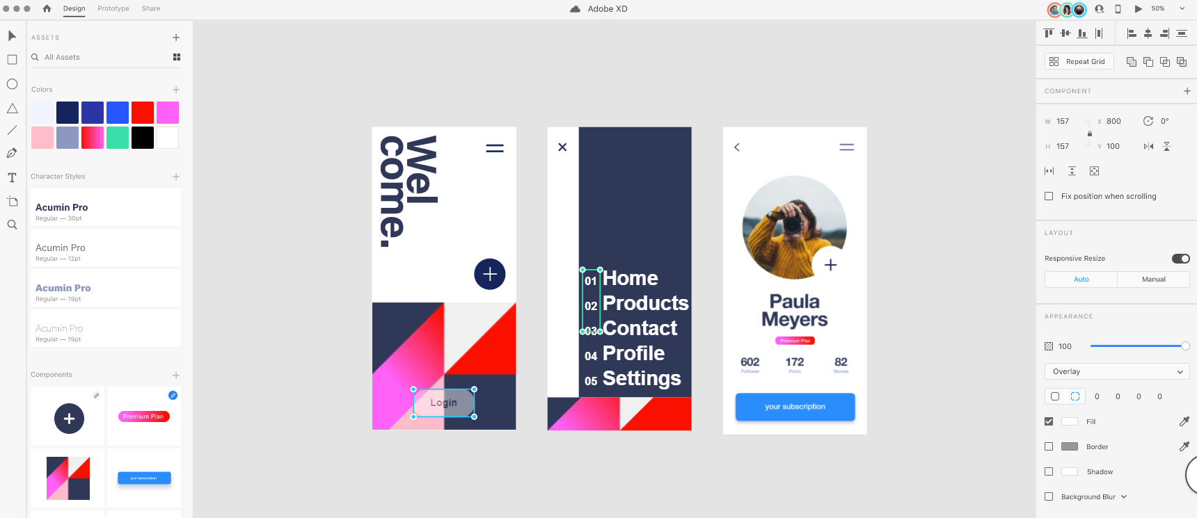
If you’re looking for more advanced tools, Adobe XD is your best choice. Especially, if you’re familiar with Adobe design ecosystem you can benefit from incorporating Adobe Experience Design software into your workflow. As a UI design software It has some strong advantages compared to Power Point that is oriented for presentation making, such as working and seamlessly switching between different kinds of grids, organizing your project and design assets, colors, etc. Some inexperienced designers however, may find it’s an overkill for the job, so the choice is yours.
You can familiarize yourself with the software here.
Adobe color wheel
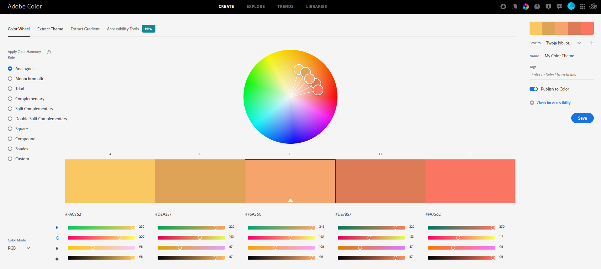
When It comes to color palette selection, your biggest strength is always your experience in designing and simple knowledge which colors go best together and which not. However, you can use tools that can help you select many colors based on design rules and select monochromatic, analogous, complementary and many more color palettes.
You’ll find the link here.
Paletton
The other tool that I can recommend to you, similar to Adobe Color Wheel, is Paletton. It uses the same methods for finding new colors, but differs when it comes to UI and UX. It’s up to you, which tool you find most attractive and easier to work with.
You’ll find the link here.
Design assets
The other important aspect of designing a report or dashboard is getting assets for your project, mostly photos and icons. Sometimes, a landing page can benefit a lot from a background photo, if it’s used in a smart way and it doesn’t distract user from the content of the page.
Stock websites
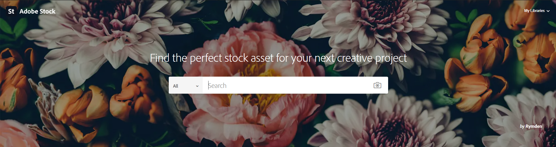
Below, you can find some most populat stock websites (keep in mind that only some are free):
Icon banks
![]()
I think that most of your reports can become more user friendly and visually attractive if you’re using icons. It makes finding similarities in report much easier for the user and decreases overall cognitive overload. There are some free icon banks, but one of the most popular is Google’s Material Design icon library. It’s totally royalty-free and well catalogued – you can find the link here.
Accesibility tools
Other tools that you may find useful are the ones that can help you double check your design for accessibility; for example checking if your text has enough visual contrast with the background or checking your color palette for compatibility with different types of color blindness.
Color blindness simulators
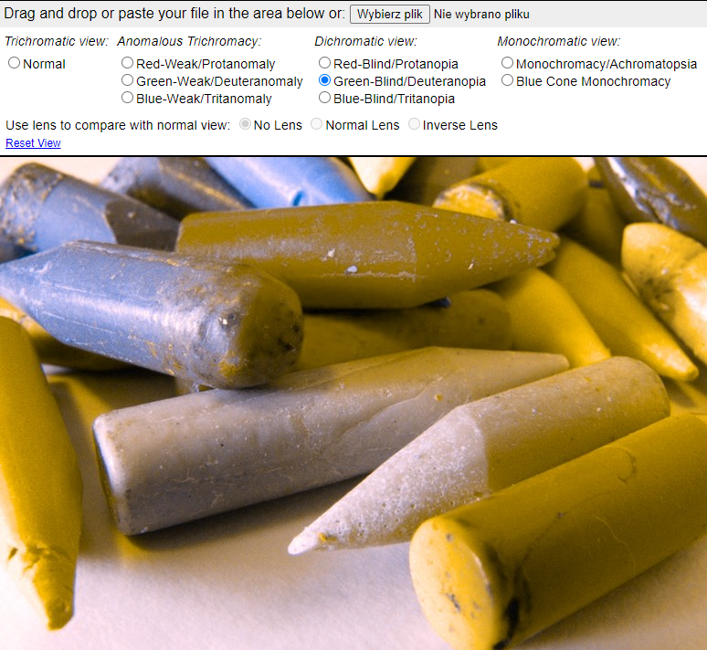
Cobilis Color Blindness Simulator is a simple, but powerful tool that enables you to upload a screenshot of your report and switch through different types of color vision deficiency such as analogous trichromacy or monochromacy. You can put yourself into a color blind person’s shoes and see how your work would look to such user.
Check out Cobilis Color Blindness Simulator here.
Contrast checker
One of the mistakes that a lot of inexperienced designers make when designing a UI is not using enough contrast between background and foreground elements such as text. Double checking with some simple contrast checker won’t take you much time but will help you make sure you’re on a good side.
Check out WebAIM contrast checker here.
Other tools
Finding inspiration
If you find yourself coming to a dead-end and being out of ideas it’s always best to look for inspiration somewhere else than your design canvas. There are a lot websites where great designers posts their projects and where you can look for newest trends in design. But remember, don’t be too inspired! Below you’ll find some links for most popular design portfolio websites.
Working with JSON theme files
If you’re familiar with JSON theme files in Power BI, you know how your project can benefit from using them. It’s especially useful when working with big projects – JSON themes can help you make sure that all reports are visually consistent and the number of customization options is amazing: from color palette selection to customizing each visual to your or your client’s needs.
Of course, you can prepare your JSON file in a notepad, but choosing some more advanced IDE such as free Visual Studio Code will make the code formatted and easier to edit.
I hope you’ll find some of the tools presented in this article useful and incorporate them in your daily work. Remember that your imagination and experience is still your most powerful tool that you can use.
Michał Stryjczak
Read more about UX design in Modern BI:
Dashboard design best practices