
Let’s talk about buttons. They seem like ordinary, insignificant part of user interface that we see everyday and we’re so used to. But still, there is quite a lot to talk about and there are some ground rules and best practices that every designer should know and follow. In today’s article I’ll try to introduce you to some of them.
Call To Action
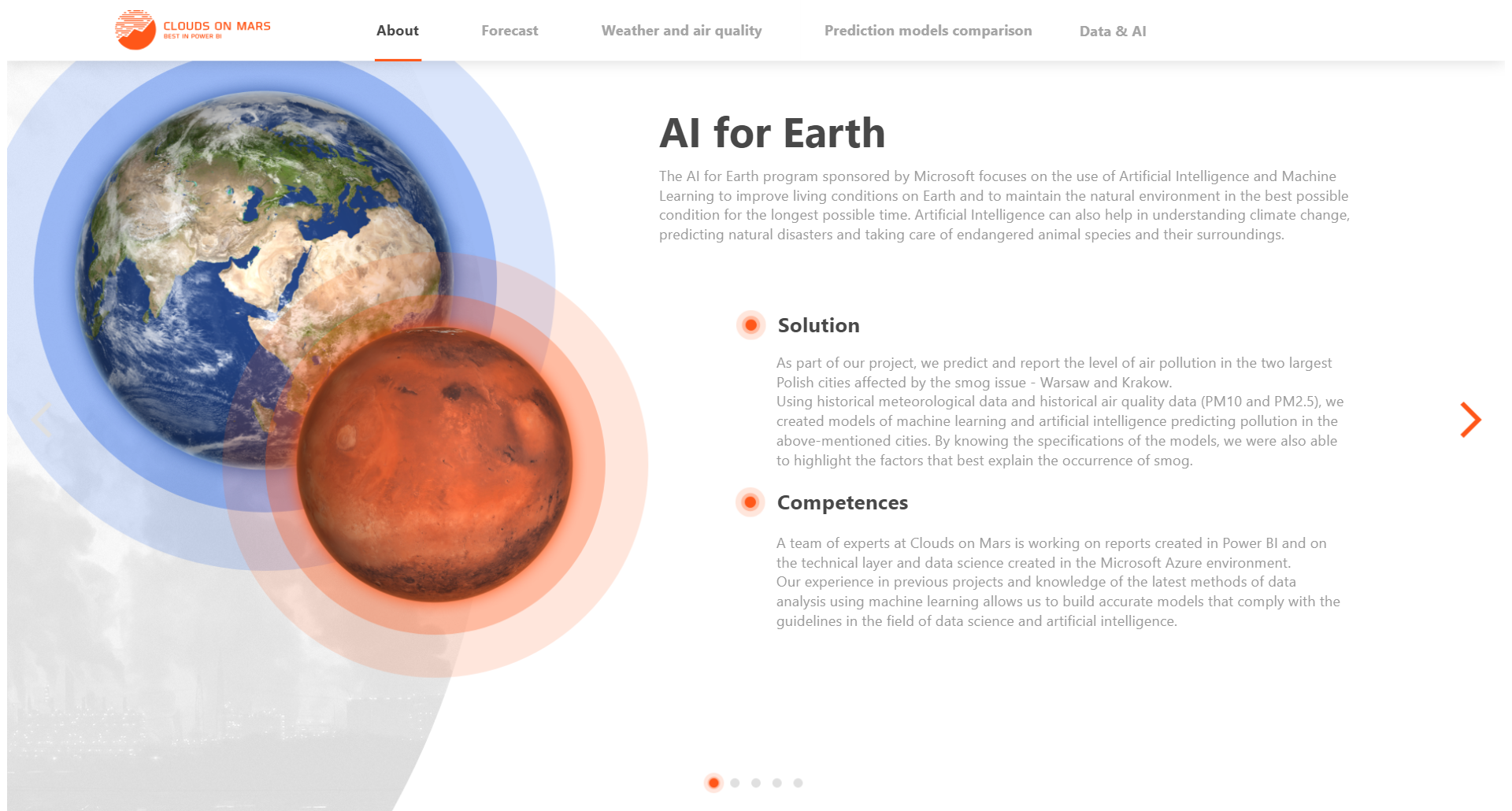
Call To Action (CTA) in design and UX is an element of UI that prompts user to perform some specific action. Call to action buttons should be easy to notice and designed in a way that the user can’t resist clicking on it. In report or dashboard design, a CTA button can be for example a button placed on a report landing page that enables users to move to the main part of the report.
- CTA buttons should be visible straight away – in order to achieve that use strong colors that have strong contrast relative to the background
- It shouldn’t be perceived by the users as static element – they should know that this is a button and it can perform an action
- There isn’t place for any confusion – It should be clear what does the button do
Navigation strategies
When designing a report there are several ways in which we can enable user to navigate between report pages. When using Power BI, we can just use built-in tabs that user will use to switch pages in Power BI Service, but I am strong advocate of creating custom navigation buttons inside report when possible. This approach has some strong advantages:
- User can use report in fullscreen mode and focus on it entirely
- We have a lot of flexibility in storytelling and guiding users through report by button placement
- Reports are more appealing and look more like well-designed webapps rather than simple Power BI reports
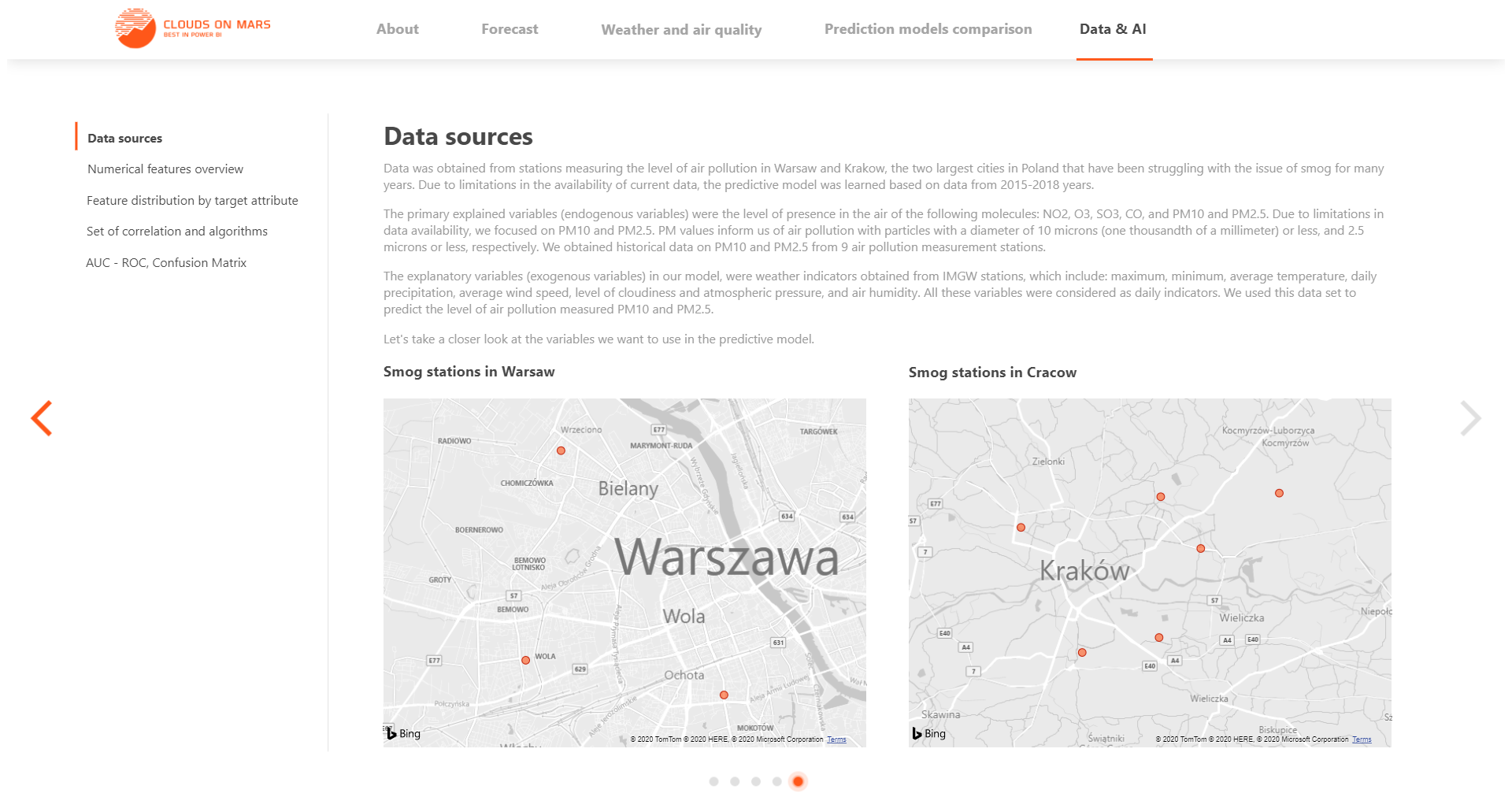
Top navigation bars
Placing navigation buttons on the top bar is well established practice. There are several advantages of that approach:
- It doesn’t take much space on the screen
- Users are used to navigation buttons in that place of the interface
However, in case of many report pages there can be simply not enough space left on the top bar. In that case you should consider side bar navigation.
Example of top bar navigation in a report
Sidebar navigation menus
If there aren’t lot of slicers in your report, you can consider placing navigation buttons on the left side of the screen. This is another well known approach to navigation used in many apps. Like in top bar navigation, remember about indicating what page is active.
Example of sidebar navigation menu
Button anatomy
Buttons can be designed in simple or quite fancy and complicated way, but they always have similar anatomy. Each button needs to convey the message about action it performs so it must contain text or an icon. When creating a text button remember that communique should be simple and straightforward – there isn’t place for elaborates and long explanations. Keep it simple. You can always put additional explanation in a tooltip if needed (actually, in Power BI you have to do it every time you create a new button).
When creating an icon based button, use shapes that have well defined meaning and that won’t confuse the user. For example, left arrow usually means “go back” so it should be used only in that context.
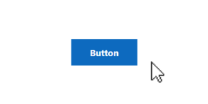
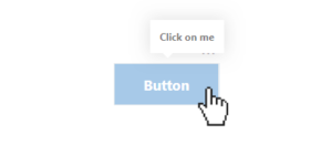
Button states
There are 6 main button states:
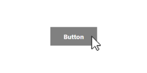
- Enabled – this state communicates that button can be interacted with
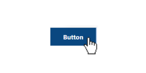
- Hover – communicates when user has placed coursor over a button (not applicable in mobile apps)
- Activated – communicates highlighted destination
- On and off – two states of a toggle button for example; each state communicates a toggle between two options
- Pressed – not as important in desktop apps; this state communicates a user tap or click
- Disabled – communicates that the button doesn’t work in specific context
Enabled state example
Hover state example
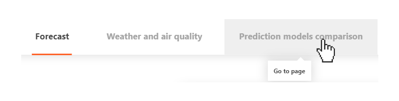
Activated, enabled and hover button states in top navigation bar
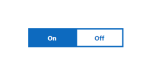
On/off states example
Pressed state example
Disabled state example
Button usage
Besides simple page navigation, we can use buttons for many different actions. For example, we can use them for clearing filter/slicer selection, applying a bookmark, switching to highlight mode or navigating to drillthrough page. The possibilities are endless and this only shows how important element of a user interface a button is.
Button styling
There are several ways you can style your buttons, but you should be smart about it. Ask yourself some questions: How important is this button? How often it will we used by the user? Does it perform crucial action?
If button is typical CTA button it should have strong contrast relative to the background. It’s always a good idea to use saturated, strong color – you should also be consistent with your “action” color – stick to one, in order not to confuse the user.
For navigation tabs, make sure to show which tab is currently selected – a typical way to do it, is by using line underneath the text or changing color of the button background or text.
For less important buttons it’s a good idea to use text-only button or outline instead of fill – you can use such buttons for clearing filters for example.
Michał Stryjczak
Read more:
Advantages and disadvantages of charts in data visualization