I believe that many (if not all) people that are familiar with the “UX” and “UI ” terms also might have heard the mysterious “wireframes”, “mockups” and “prototypes”. What’s all the fuss is about? Are those any important to you as a designer and your clients? Are they useful when it comes to report design? Let’s find out.
Wireframes in UX design
When designing new webapp, website or even report or dashboard, wireframes are best place to start. Basically, wireframes are a low-fidelity representation of the product and are used at early stages of design – before the development and even before talking colors. Purpose of a wireframe is to quickly communicate the content of the page, it’s layout and functionalities. By having the most simplistic approach to wireframe design you’ll save yourself a ton of unnecessary work at the beginning. Why? When you want to present your idea to the client and make sure you get all their expectations and requirements right there is no point in giving them finished, pixel perfect design with polished color palette and typography. At early stages the most important thing is that the UX is right, the layout is well thought and that you included all necessary functionalities. It’s better even not to include colors and component styling in your wireframe, so the client is more focused on how it will work rather than if they like the design. That should come later once you have basics right.
Wireframe should communicate:
- Content and layout
- Functions of the product
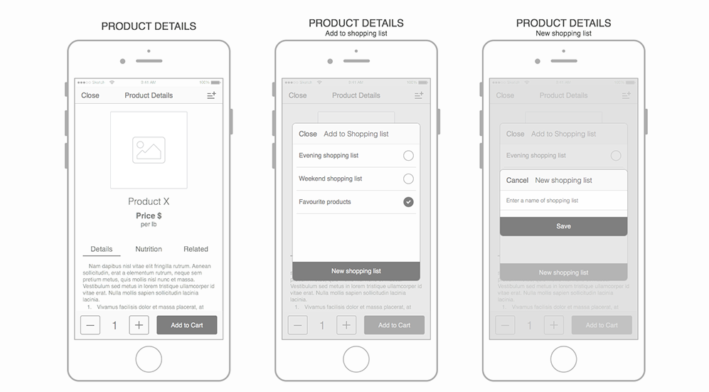
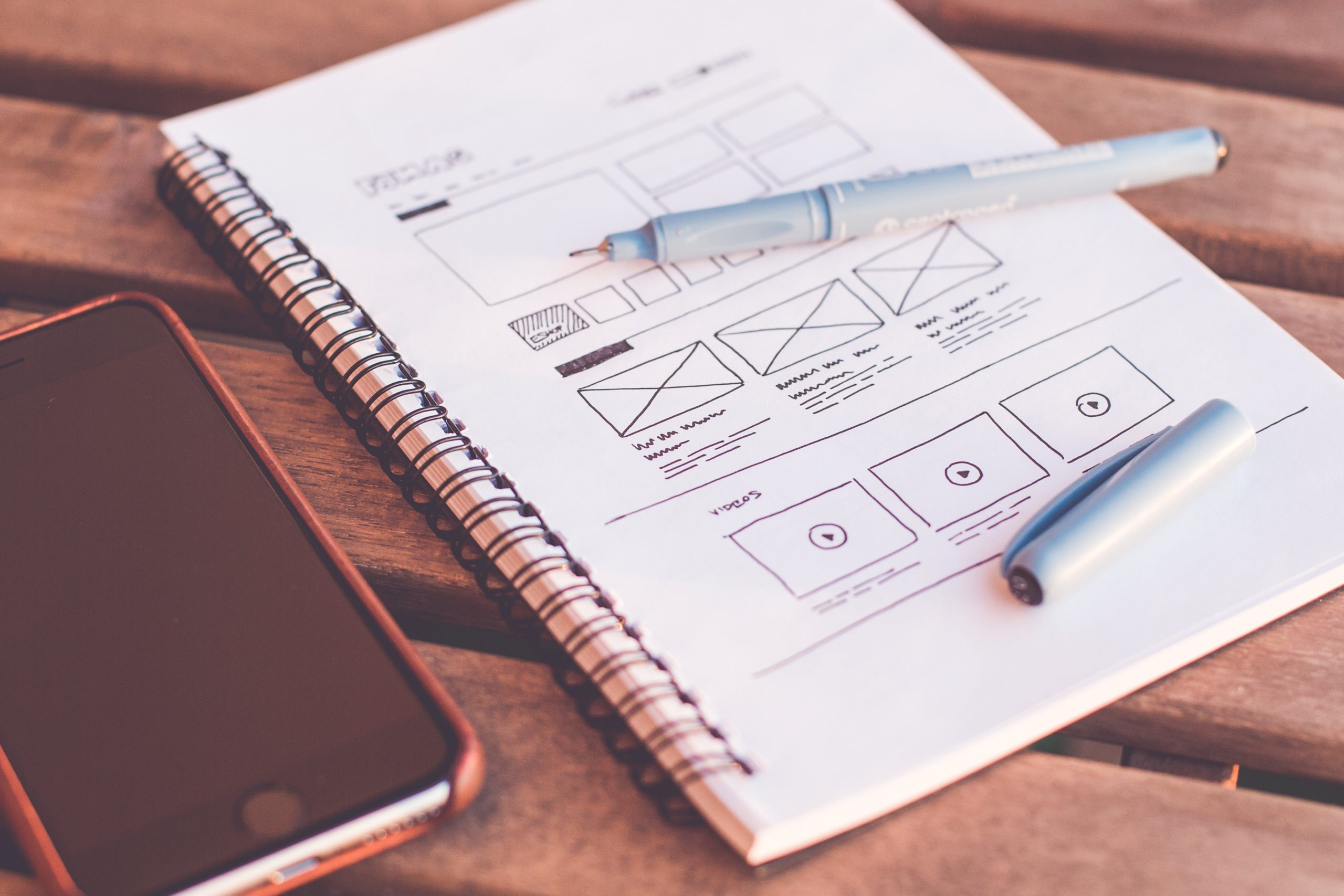
Below you can see a couple examples of how wireframes look. As you can see, you can even use a piece of paper and a pen.

Example of wireframes by Volodymyr Melnyk (source)

Wireframing on paper
Mockups in UX design
Mockups are one level higher than the wireframes when it comes to how close they are to finished product. Once you have your layout planned, you know how your app or dashboard will work there’s time to actually “design” in a way that most of people understand it. Mockups are useful tool to communicate to the stakeholders how finished product will look like, give them an insight into design before the development starts so you’re also avoiding unnecessary rework. At this point you should discuss with the client how they feel about the design in more depth: talk buttons, colors, typography, spacing and other graphics.
Mockups should include:
- Overall look & feel
- Typography
- Colors
- Styled buttons
- Whitespace and spacing between components
Finalized mockup is also a blueprint that developers can use to bring working product to life.
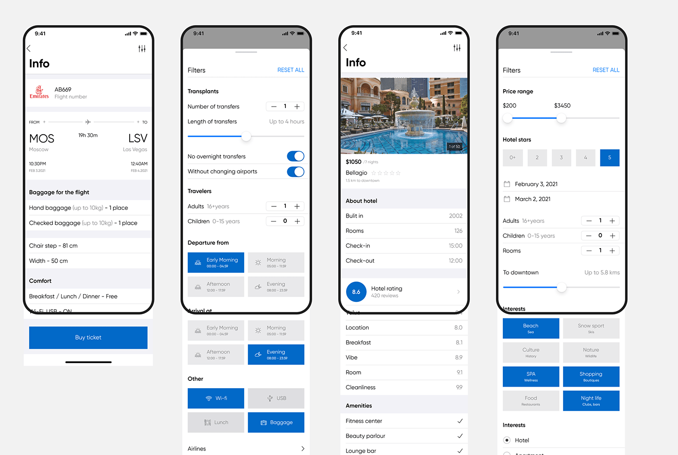
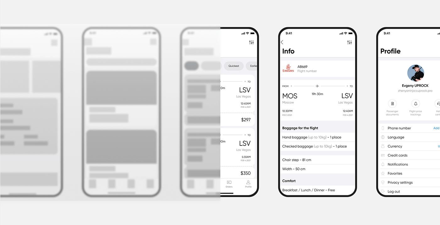
Below you can find some examples:

App mockups by Sergey Panin (source)

Example of wireframes and mockups by Volodymyr Melnyk (source)
Prototypes in UX design
Prototypes are closest to finished, working product. A prototype is high-fidelity, functional representation of the user interface: it should include working navigation, transitions and sometimes even animations. The purpose of the prototype is to test your design almost in “real life” environment: check if the user flows are intuitive and are done right, if there are any steps that may confuse the users – at this stage you should do the user testing and implement changes before you hand down the project to developers.
Prototypes, aside from being a useful tool for user testing and collecting feedback, are also helpful to developers – they can see how the product should work in real life and better understand their task.
The main purpose of prototype is again to save time, effort and money that could go into developing wrong product straight away.
Low fidelity prototypes
Prototypes doesn’t have to be always high-fidelity and not every detail has to work like in real environment.
Fidelity can vary in different areas such as:
- Visual design
- Content
- Interactivity
For example, you might want to show your stakeholders how navigation will work and let them click around. Or, you might want to test any other functionality – in that case you can prototype at early stages and use iterative approach. You can also create clickable wireframes in order to test the UX and not focus on visual design.
Summary
Wireframes, mockups and prototypes are powerful and effort-saving tools that can help you in your design process when it comes to confirming requirements, user testing or collecting feedback. So if you want to deliver a project with a great UX and minimize chances of unnecessary rework you should consider including them in your toolbox.
Michał Stryjczak
Read more:
