I want to talk about data visualisation today and raise the subject of how we can improve our data case studies.
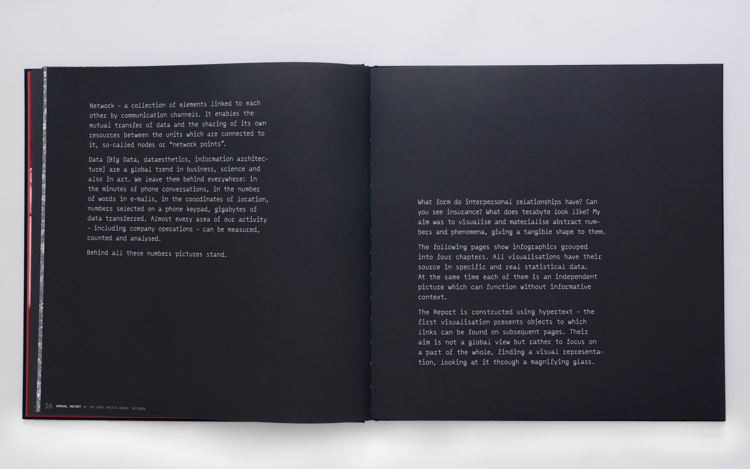
I want to show you one of my favourite data presentation. In this case, non interactive report – a book, The Annual Report of the ERGO Hestia Group made by Hanna Piotrowska (Dyrcz).
Data Story almost always at the first place
Understand your data and try to think about it as a story. How can you visualise it and how can you create an interesting way of presenting the data? In this case Hanna Piotrowska (Dyrcz) gives us a brief explanation of her point of view and her own story of this data. In my opinion it’s crucial to be sure about who you’re speaking to and that you’ll be understood by the viewers. Not everyone is data scientist who knows how to read specialistic charts – as designers we should make sure that our work will be understandable. At this point you have to be aware that your visual approach should be strongly determined by your audience – internal, operational report will be different than a case study based report.
Express your data
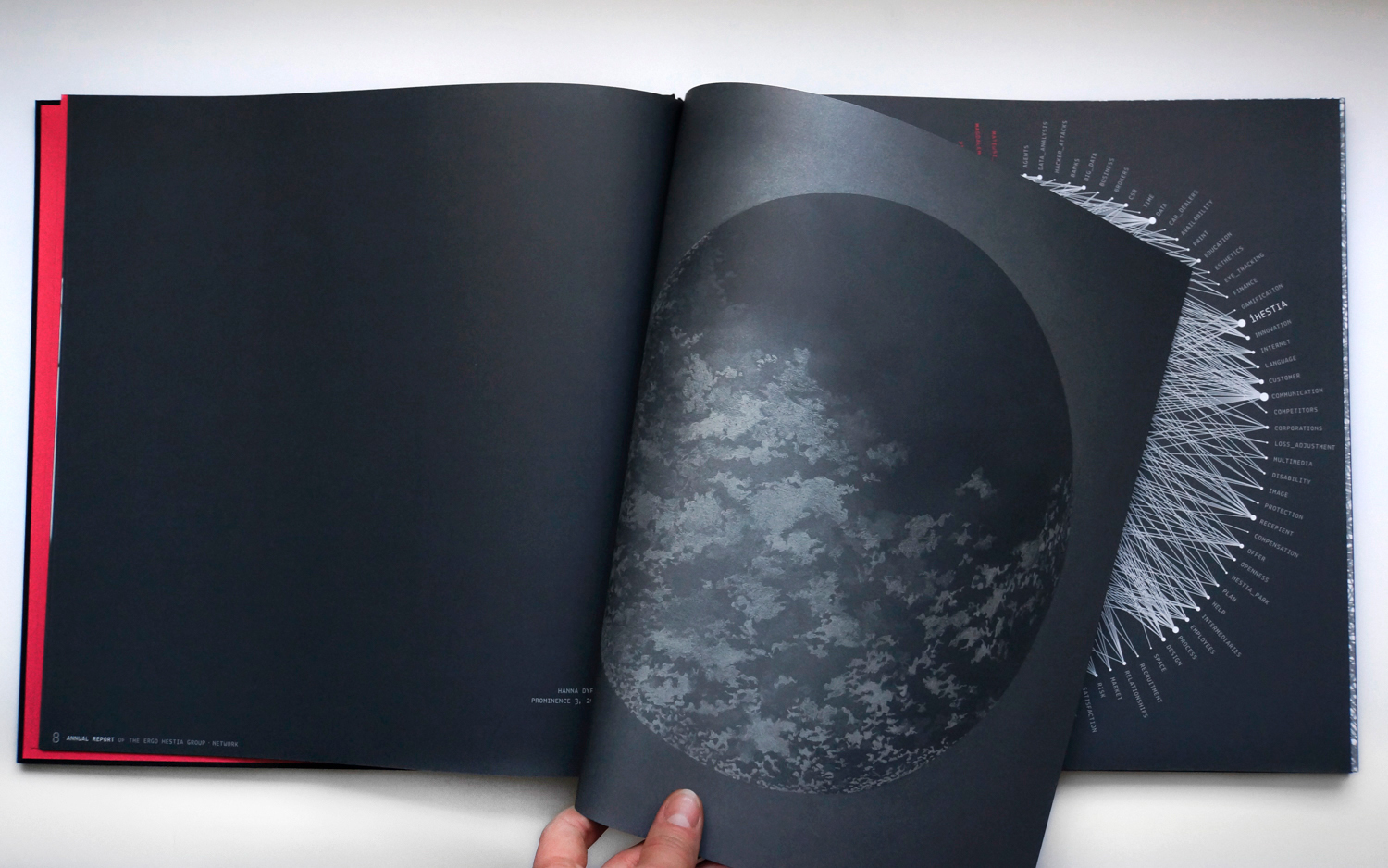
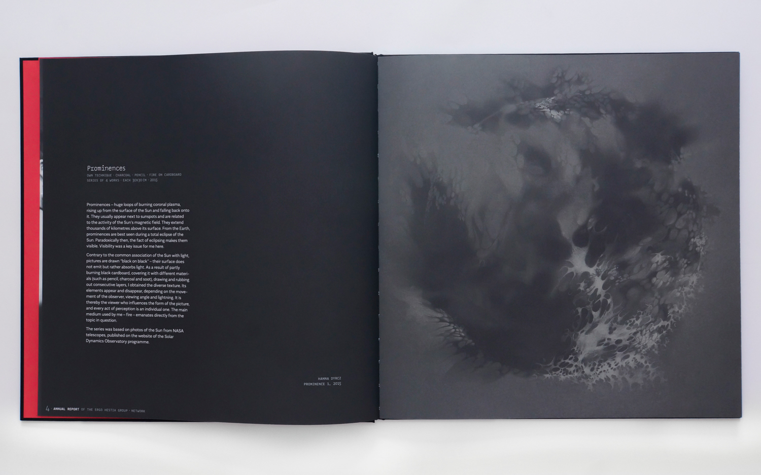
If you have good understanding of who you’re speaking to you can determine yout visual language and type of communication in your report. As I mentioned before, operational and very analytical report should be very simple and based on the well understandable chart types, but in this case Hanna Piotrowska (Dyrcz) had the opportunity to add another dimension to her work – art – and it’s brilliant! It immediately sets the mood, adding interesting visual anchor to the report. If you read a brief explanation you’ll understand how strongly it’s connected to the report subject.
Ballance your story
I think you might find the temptation to overload your report with designer’s creativeness. Make sure that your art will not cover up the data, hide important information and became only a creative show – keep everything on the right track.
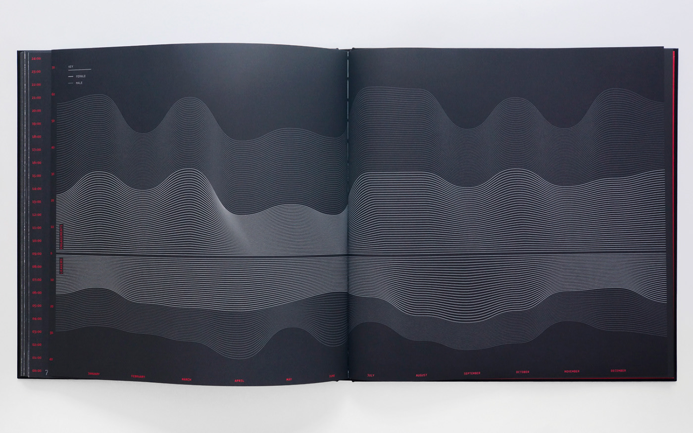
Contrast your story
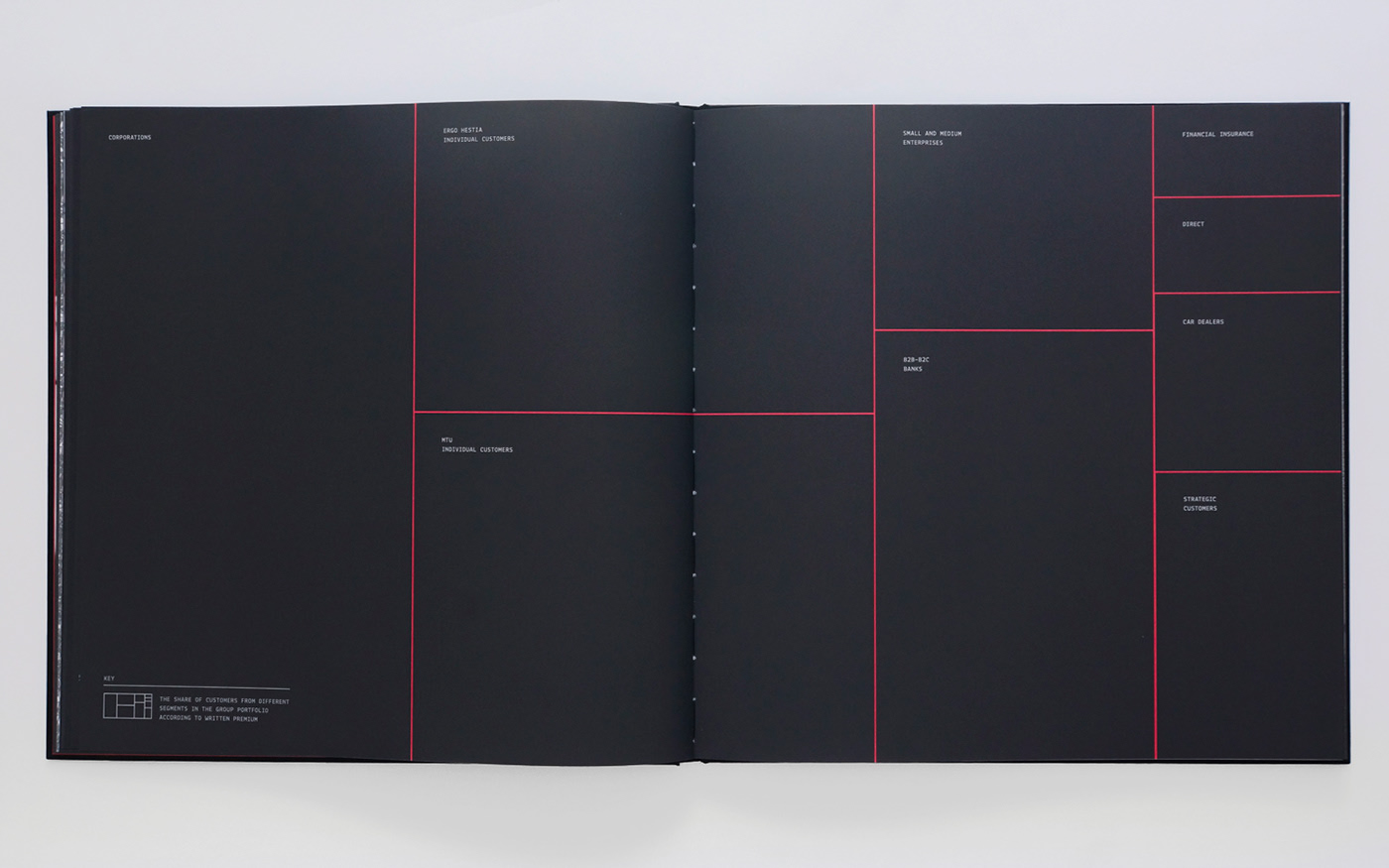
What I mean by that? Contrast is a very powerful way to express your story in many ways. You can show two extreme data points to make an impact, you can use two extreme colors to show big differences etc. But, you can also show the contrast by using the scale and visual expression of the data. At this point, I want to mention that in my opinion, not every data visualisation has to be well readable! Think how to combine your data and visual language to take your story to the next level – how to show scale or emotion behind very analytical data?
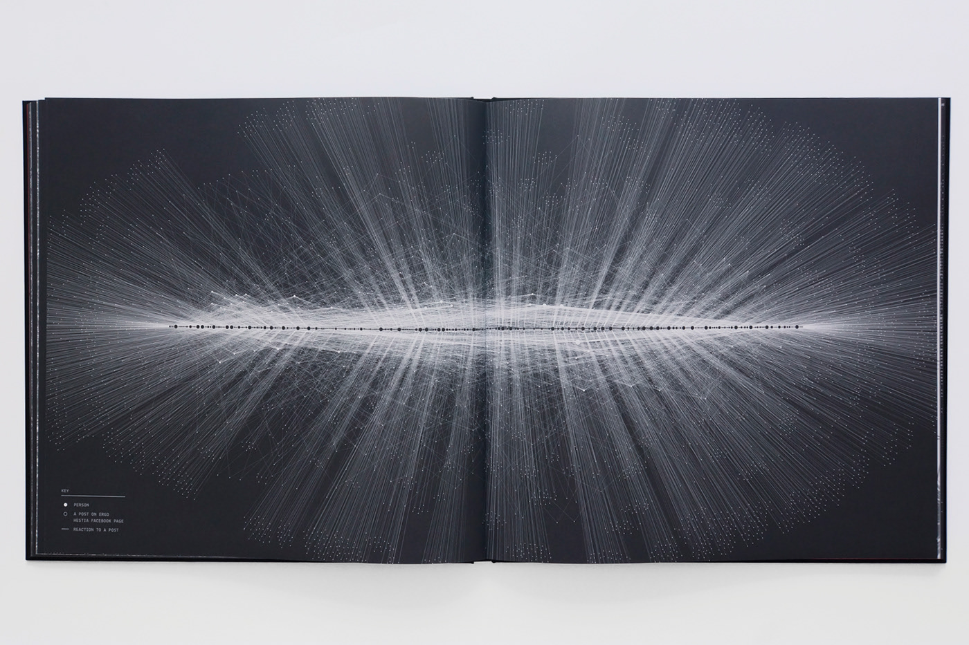
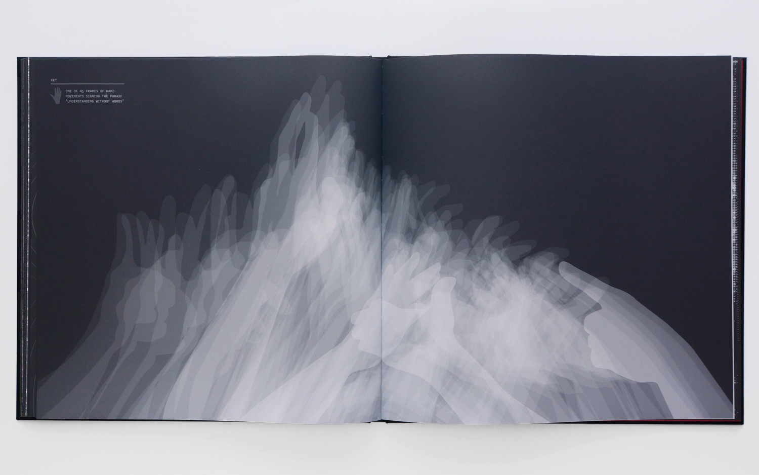
I know that I presented today strongly different approach to data visualisation than the one you’re used to when working with it on a daily basis. I hope I didn’t scare you but rather showed another way of thinking which we all can consider in our data visualisation and reports.
I strongly recommend to explore more works of Hanna Piotrowska (Dyrcz) here:
https://www.behance.net/hannapio
Greg Stryjczak
Read more:
Storytelling in design and data visualisation
