Power BI reports are much more advanced than classical, static BI reports when we’re talking interactivity. Our design should encourage user to click around and “play” with the visuals in order to find new insights and better understand the data behind it. Of course, it doesn’t mean we should enable all available cross filtering features and consider our job done – we should give some thought to the way user might interact with the data visualizations presented to him and disable all unnecessary visual interactions.
Slicers use in Power BI
The first thing that comes to mind when thinking about report filtering are good ol’ slicers. Business report users are most used to this type of data filtering – it’s easy to understand and work with, but still there are some design tips we should keep in mind when introducing slicers to our audience.
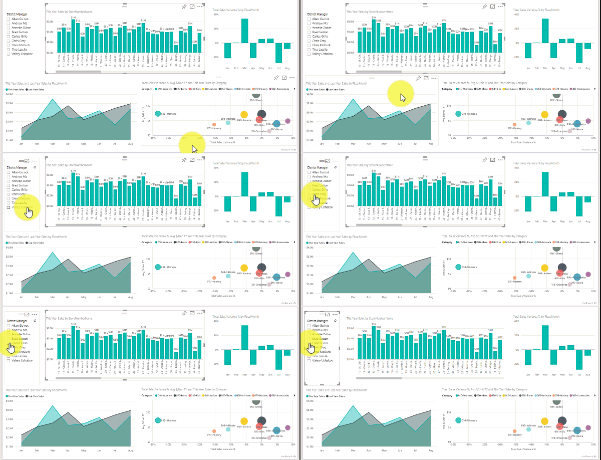
Picture: Power BI slicers in action (image source)
First thing is slicer placement – it’s important to be consistent (in my opinion this tip applies to design in general and I can’t say enough how important consistency is). If you’re using the same set of slicers on multiple pages in your report they should be placed in the same area on every page in order not to confuse user that’s already used to seeing them in one particular place on the screen. The most classical approach to slicers placement is to use a slicer panel on the left or right of your report canvas. If you’re working with smaller amount of slicers, you might consider top bar of your report for placing the slicers. But remember, this applies to slicers that filter all visuals on a given page.
If you want to apply one slicer to any specific visual, the general rule of thumb would be to place this slicer in close proximity (on the same visual background i.e.). That way you won’t confuse the user as for what the slicer does and which visual it interacts with. We’re using design’s proximity principle that says that things that are related should be close together. Of course, you cannot forget to disable all unnecessary interactions with not related visuals.
If the project you’re working on gives you the opportunity to use custom visuals from Microsoft’s AppSource I strongly encourage you to browse through them in order to find inspiration and more user friendly ways in which you can enable users to filter data. Great example is chiclet slicer that resembles well known “chips” used in UI design all over the web and digital products. As it lacks some design customization features and can negatively impact your report’s performance it’s still worth to consider.
Slicer synchronization
It’s important to mention slicer synchronization when we’re talking slicers. As stated before – not all slicers should be always synchronized with all visuals but you can make your report more user friendly by synchronizing slicers between specific pages. If you’re working with same set of slicers on multiple pages you should consider enabling synchronization – that way user can maintain slicer selection then working with the report. You should remember to include “Clear filters” button that triggers bookmark that clears the selection on all slicers in order to make life easier for the end user so they doesn’t have to uncheck all selected slicers.
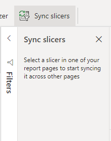
Picture: slicers synchronization
Filter pane
Filter pane can be your friend, especially when working with cluttered reports that include multiple visuals on a single page and finding space for classic slicers might be a challenge. As I consider slicers more user friendly as they’re visible straight away and have more customization options, sometimes choosing the filter pane might be the only way to go. You should keep in mind some simple tips that might improve the user experience:
- Play with colors – you can use your main UI color as the filter pane background. That way it will be more visible when closed and it will suggest interactivity to the user.
- Sort your filters from most to least important.
- When not using filter pane, disable it in order not to confuse the user.
Interactions between visuals
Conscious approach to interaction between visuals on your report page might have a big impact on overall report user experience. Power BI gives you two options: filter and highlight and it’s important to know when to use which.
Power BI Cross filtering
Cross filtering simply works like applying a slicer, but it triggered by clicking on a visual (a particular bar on a bar chart for example). Other visuals then respond accordingly to user selection by filtering themselves. Users can also use multiple levels of cross filtering by using CTRL+click combination.
Highlight
Highlight feature works similar to cross filtering, but the data on the visuals is not being filtered completely, and filtered values appear opaque.
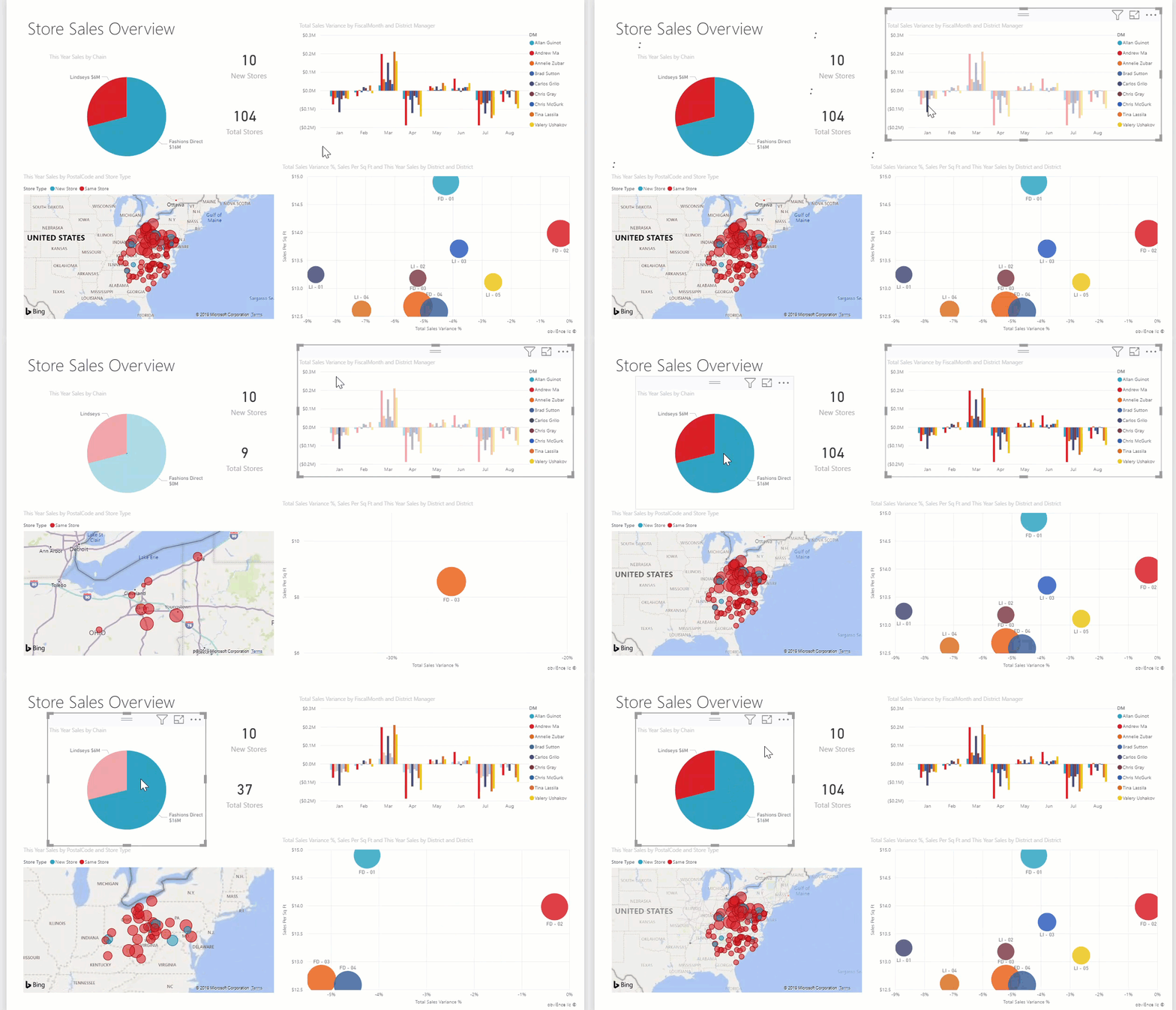
Picture: highlight feature in action (image source)
Which to use?
In most cases I’d use filter interaction feature. I believe it’s easier to read as sometimes, when using highlight feature it might hard for the user to distinguish between filtered and non-filtered data, especially when working with some specific color palette, or set of visuals or if the highlighted value is very small compared to non-filtered data. However, highlight feature might be useful when we want the user to focus on part to whole relationship.
However, you should always consider if enabling filter or highlight interactions between given visuals brings value to the user and if it’s really necessary. If not, simply disable it – I know, sometimes that can be quite tedious

Picture: edit interaction option in Power BI
Power BI edit interactions
I should probably mention, that Power BI offers a way to set the default visual interaction – enabling or disabling this option can speed your work up by a lot after you decide which interacion mode you’re going to use the most in your report. Simply go to options -> report settings (Current file) -> Visual options -> Change default visual interaction from cross highlighting to cross filtering.
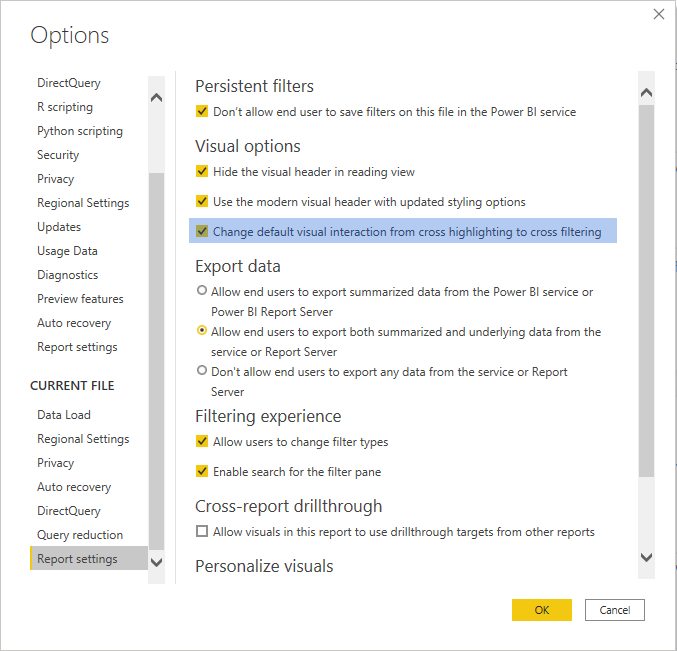
Picture: default visual interaction in Power BI options
Spotlight feature
The spotlight feature is not widely used in reports (at least from my perspective) but It’s a tool that’s worth having in your report designer’s toolkit. You can draw user’s attention to most important, crucial data by using a button with a bookmark connected to it that captures a visual in a spotlight mode. Read more about the spotlight feature here.
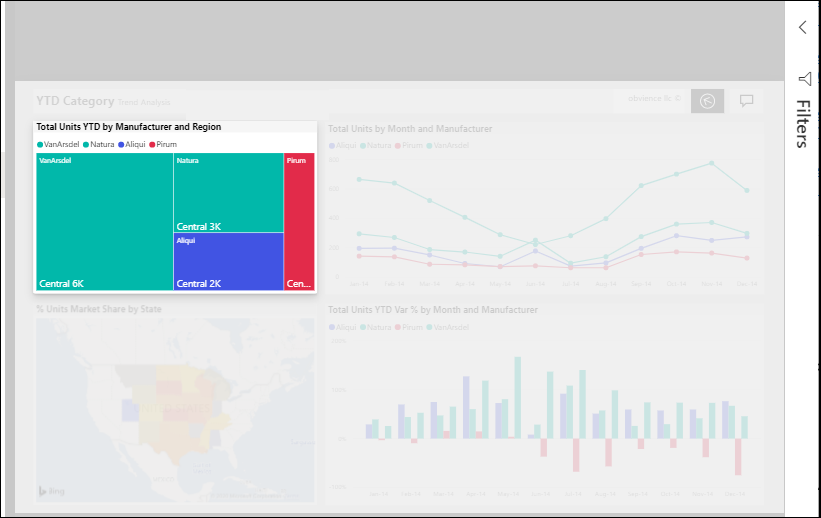
Picture: Spotlight feature (image source)
Other ideas
You can also use bookmarks to present some specific perspective to the user. Simply create a button (you can read more on this topic in one of my previous articles here) and connect it to the bookmark with data synchronization option enable in the bookmark’s settings. You can prefilter the report page to draw attention to any given business case – the key here is to be clear in how you name the button so it’s clear for the user what it does.
Conclusions
As you can see, Power BI gives report designers quite a few options to choose from when designing for interacions. It’s always important to keep in mind how your audience will use the report and get to know the business goals and scenarios. I hope that by becoming familiar with tips presented here working with interactive reports will make your life a little easier.
You can read more on the topic here:
https://docs.microsoft.com/en-us/power-bi/create-reports/service-reports-visual-interactions
https://okviz.com/blog/design-guide-for-power-bi-slicers-and-filters/#
Michał Stryjczak
Read more:
Introduction to visual hierarchy
How adopting UX and following the best standards can improve your BI
