

By Michal Potasinski & Agnieszka Bak
Have you ever wondered why ESG Data Visualization matters in today’s intricate business landscape? In a world shaped by Environmental, Social, and Governance (ESG) considerations, data isn’t just numbers – it’s the compass guiding companies toward a sustainable future. But how can you visualize it so it’s simultaneously eye-catching, exciting, and informative? What are the key pillars of data visualization, and what are the things to avoid while making an ESG dashboard? You will find answers to all those questions in this article.
ESG Data Visualization – benefits
ESG data present an intricate landscape of indicators spanning diverse dimensions. In areas such as emissions, diversity indicators, and management practices, inherent complexity comes to the fore. It is further compounded by the constant flow of data points corporations report. To put this into perspective, consider the latest version of the European Sustainability Reporting Standard (ESRS), which covers a whopping 1,144 different data points.
Moreover, as this multifaceted data ecosystem expands, it’s met by an ever-growing consortium of stakeholders. Among these, you’ll find myriad actors – managers, investors, policymakers, customers, employees, analysts, academics, researchers, and even journalists – each seeking to glean insights from the wealth of ESG data. It’s an expansive audience, each with its unique needs and abilities. And here lies the crux: the challenge of ensuring comprehensibility and accessibility.
How can we ease a comprehensive understanding of this voluminous ESG landscape? The answer lies in data visualization – a conduit through which we can empower this diverse group to grasp the intricacies of disclosed ESG data swiftly and thoroughly. Through well-crafted visualizations, the complexity becomes clear, the arcane becomes accessible, and the ESG landscape becomes a narrative we can all interpret.
So, what are the benefits of correct ESG data visualization for reporting companies? Below, we have listed the most important ones:
- Enhanced Understanding
Data can be convoluted and overwhelming, especially with intricate ESG metrics. Effective data visualization simplifies complexity by transforming raw numbers into intuitive visuals. It provides a clear roadmap to understanding the underlying patterns, trends, and relationships present within the data. By giving information in a digestible format, data visualization facilitates quicker and more profound comprehension, even for non-experts.
- Efficient Communication
Humans are inherently visual beings. We process visual information much faster than text or numbers. Correct data visualization enables concise and efficient communication of insights. It allows decision-makers to grasp the key takeaways, which is crucial in time-sensitive scenarios. Visuals have the power to transcend language barriers and communicate across diverse audiences, making them an essential tool for bridging gaps in understanding.
- Engagement and Attention
A well-designed data visualization captures and maintains viewer engagement. When presented organized and visually appealing, it captivates the audience’s attention, encouraging them to delve deeper into the insights being delivered. This engagement is critical in ESG reporting, where stakeholders and investors must connect with the information to support sustainable initiatives.
- Contextual Data Exploration
Correct data visualization allows users to explore the data contextually. By highlighting key points and allowing for interactive exploration, users can delve into specific aspects of the data that interest them the most. This approach promotes a deeper understanding and encourages the discovery of correlations and trends that might not be immediately apparent from a mere tabular presentation.
- Informed Decision-Making
Decision-making based on data is only effective when the data is accurately understood. Correct data visualization aids in informed decision-making by presenting relevant information in a way that supports actionable insights. Visuals guide decision-makers towards identifying opportunities, addressing challenges, and formulating strategies aligned with ESG goals.
How to visualize ESG data effectively
Now that we understand the importance of ESG data visualization, let’s take the next step and explore how to visualize ESG data.
- Understanding
Before creating a design, understanding the data you are working with is crucial. Know its structure, relationships, and the story it needs to convey. In the ESG context, it’s critical to comprehend the individual data points and discern the overarching implications they carry. Recognize the interconnectedness between environmental factors, social dynamics, and governance practices. Each piece of data is a thread woven into the larger fabric of sustainability, corporate responsibility, and societal impact. Delve into the nuances to reveal patterns that might otherwise remain hidden.
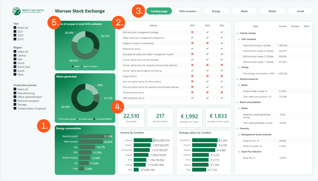
Figure 1. An example of a well-designed ESG dashboard by Clouds on Mars
- Communication
Choose the proper visualization that conveys information efficiently, enhancing communication. For example, use green colour while preparing reports on environmental topics (Fig. 1 – 1). This solution has been applied to our exemplary dashboard; it has a green, monochromatic tone, which refers to the environment. The most critical data is shown on a dark green background that attracts attention. It is simple and good looking, and the dashboard has the right style and colours, which fit the subject. Also, charts were made in green tone, which greatly fits the rest.
- Engagement
A simple dashboard, which avoids clutter, is crucial to keep viewers engaged (Fig. 1 – 2). We used tables to be able to present a bigger piece of data. Despite having much of it to show, we didn’t create chaos. We used red crosses and green checks, which made the visualization even more interesting for readers. Everyone likes simple solutions that are eye-friendly. Also, interactive segments can help keep viewers’ attention (Fig. 1 – 3). We used buttons that allow the user to change the current page of our visualization. It makes more space for data to visualize without making an additional mess or chaos. Buttons and other interactive elements can make dashboards more unique and outstanding.
- Data Exploration
Emphasize key points to draw attention and provide context (Fig. 1 – 4). We decided to show the most important numbers and statistics in special boxes. It makes our dashboard transparent and easy to understand. Most important data should be separated to be more visible on the dashboard. It makes the data analysis easier.
- Storytelling
Use contrasting colours for emphasis and guide the viewer’s attention. Best dashboards are like novels; they show the reader a story. Place crucial information at the top left (Fig. 1 – 5) – where attention naturally gravitates. Data shown on our exemplary dashboard is placed in importance order. The most crucial elements for analysis are placed on the left side of the page. As you travel to the right side, you can see the more detailed data.
How do we avoid bad data visualization?
Now, as we know the most essential benefits of correct data visualization, we must face the truth: It’s more complicated than it looks. To make your road through ESG Data Visualization easier, we will show you some “don’t-s” that you can avoid in the future:
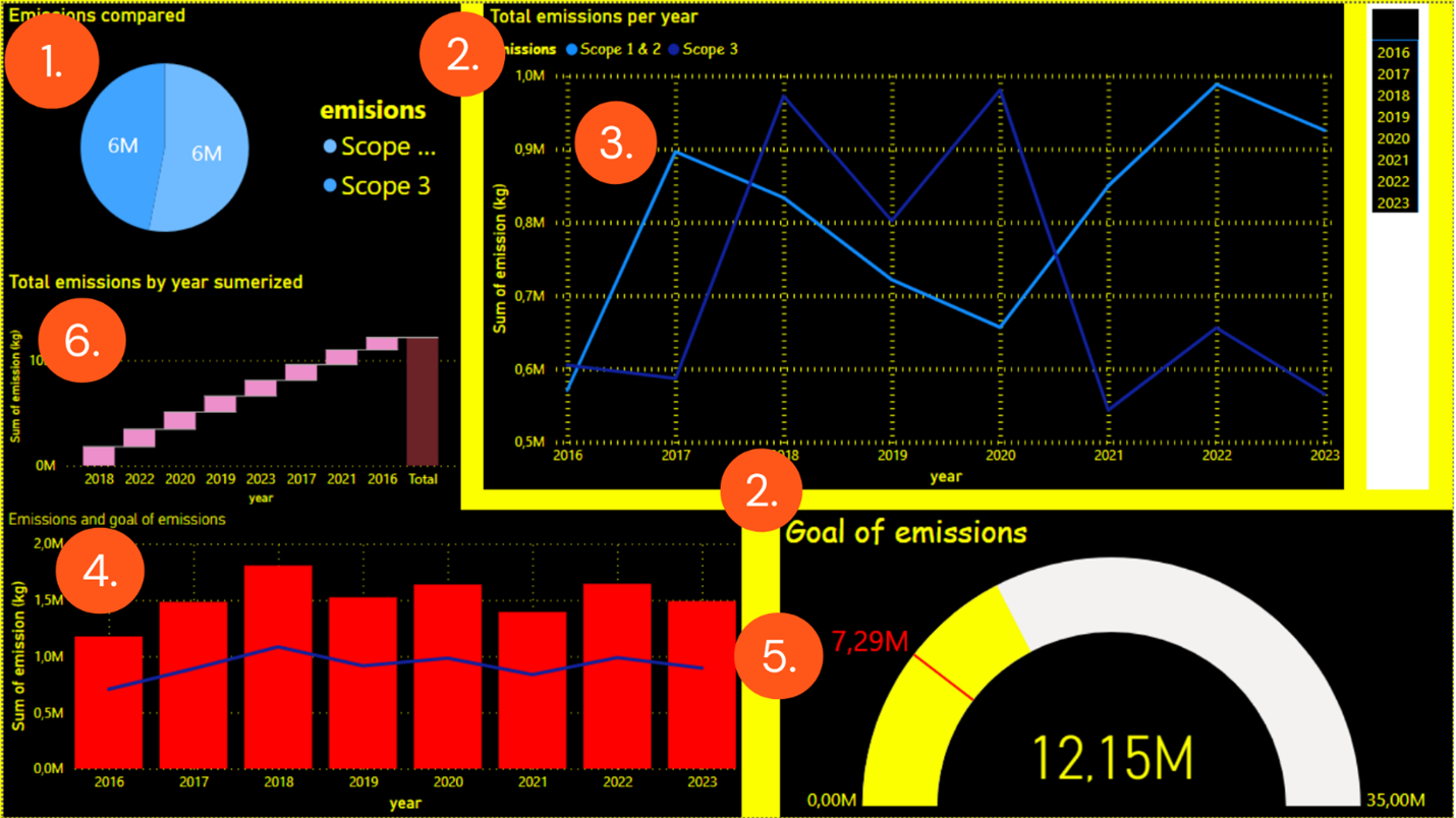
Figure 2. An example of inefficient ESG data visualization
- Information Overload
Take a look at this dashboard created for our teaching purposes. Is it easy to understand? It seems chaotic, inundated with data. To prevent overwhelming viewers, maintaining consistent design elements is key. Chaotic presentation hampers the communication of valuable information and obstructs understanding. The solution is simple: prioritize simplicity in visualization. Visualizations are designed to help tell the story of the data. Therefore, remove charts that do not convey anything relevant to the recipient (Fig. 2 – 6).
- Difficulty in Comparisons
Arrange visualizations logically to tell a coherent story. Avoid distorting proportions or using similar colours for disparate elements. As you can see on the dashboard (Fig. 2 – 1), the pie chart is in two in two similar shades of blue, and despite representing the same amount of emissions, the two parts are different in size.
- Loss of Engagement
Use a limited colour palette in one font, and consider accessibility for a wider audience. Dashboards should be informative, eye-catching, and formal. Use colours that are “cooperating” with each other. Vibrant ones are reserved for the most critical data, not the background elements. On the presented dashboard (Fig. 2 – 2), the background is way too bright and the applied fonts are inconsistent.
- Misinterpretation
Highlight the most important insights to draw attention and provide context. Do not use red or green for casual statistics (Fig. 2 – 4). Red is associated with negative information, while green has a positive meaning and is used to show the improvement in statistics.
- Charts should start from zero-level
While creating a chart, make sure that the starting point is 0. As you can see on the exemplary dashboard (Fig. 2 – 3), the total annual emissions start from 0.5M. It’s also hard to see the navy-coloured lines because of the dark background.
- Ineffective Communication
Incorporate interactivity for deeper exploration of the data. Do not show too much on one page. Crowded information will be difficult to read. Use interactive segments to display more information if needed.
Emerging Trends in ESG Data Visualization
Mastering the fundamental elements of accurate data visualization is an ongoing journey. As fashion trends evolve, so do trends in data visualization, introducing new possibilities. That’s why you must be up-to-date to be the top data visualizer. Here are some recent trends:
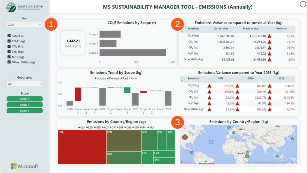
Figure 3. Recent trends in data visualization
- Interactive Dashboards for Holistic Insights (Fig. 3. – 1)
Incorporate responsive design for cross-device usability. Engaging dashboards fosters user involvement, employing interactive maps, buttons, and charts to enhance comprehension. On our third exemplary dashboard, we used interactive elements such as filters and buttons, which can help analyze the data. Readers can check different parts of their data by clicking on each.
- Storytelling through Infographics (Fig. 3. – 2)
Test and iterate the dashboard design for user understanding. Infographics and images capture readers’ attention, transforming chaos into organized clarity. We visualized much data on our exemplary dashboard but in order and clarity. This amount of data can be visualized chaotically, leading to users’ misunderstandings.
- Geospatial Mapping for Global Insights (Fig. 3. – 3)
Balance aesthetics and functionality to convey accurate information. Maps are trendy among the readers. They are the most engaging interactive elements, which can help analyze international data. We used a simple map of the earth to show graphically where most emissions are being produced.
Why Partnering Up is the Best Way to Start?
To create appealing visualizations, one must stay constantly attuned to the latest trends and innovations. Here, Clouds on Mars comes in – a visionary team comprised of ESG analytics and graphic design experts. We bring a profound understanding of ESG principles, metrics, and analytics, transcending the role of mere designers to become true masters of data-driven narratives. Our expertise lies in transforming complex data into captivating visuals that elucidate the intricacies of ESG impacts and seamlessly merge expertise and artistry.
It’s crucial to understand that data visualization is more than just graphics; it’s about revealing the compelling story concealed within your data. With Clouds on Mars as your partner, your ESG journey transforms into a vibrant narrative that inspires change and progress and contributes significantly to forging a path toward a brighter future.
If you want to deep dive into our ESG solutions or just need help understanding the ESG impact on your business and how the above tools could be adjusted to your demands do not hesitate to contact our ESG team at ESG@cloudsonmars.com
Read more about ESG Reporting on our blog:
Corporate GHG and Scope 3 Accounting